Cancellations of invoices is a practice that we want to limit, as it
can impact revenues and can produce operational difficulties.
In this document we will try to understand when a cancellation takes
place, using a machine learning technique called decision tree.
- pre-validation of the analysis
As previously
seen, the cancellation rate for our cleaned data frame is
16.64%, meaning that almost 1 out of
5 invoices is being cancelled.
df %>%
  mutate(Status = if_else(str_starts(Invoice, "C"), "Cancelled", "Confirmed")) %>%
  group_by(Status) %>%
  summarize("Number of Distinct Invoices" = n_distinct(Invoice)) %>%
  mutate(Percentage = formattable::percent(`Number of Distinct Invoices` / sum(`Number of Distinct Invoices`))) %>%
  arrange(desc(`Number of Distinct Invoices`))
From a sales and operations point of view, it being a big or small
number depends on various internal factors, but for the sake of this
analysis it can cause some problems as the number of cancellations can
be so small, compared to the confirmations, that the algorithm is not
able to “learn” their characteristics, thus providing erroneous
results.
To assess that we can use some graphical methods, but first let’s
present the data frame we will feed into the algorithm:
(treedf <- df %>%
  group_by(Invoice) %>%
  summarise("Number of Distinct Stock Codes" = n_distinct(StockCode),
            "Median Quantity" = median(abs(Quantity)),
            "Median Price" = median(Price),
            "Total Quantity" = sum(abs(Quantity)),
            "Total Revenues" = sum(abs(Quantity) * Price)) %>%
  left_join(df %>%
              mutate(Cancellation = factor(if_else(str_starts(Invoice, "C"), TRUE, FALSE))) %>%
              distinct(Invoice, Cancellation), by = "Invoice"))
So, for every Invoice, we have quantitative information
plus a binary column that deemed if it has been cancelled or not.
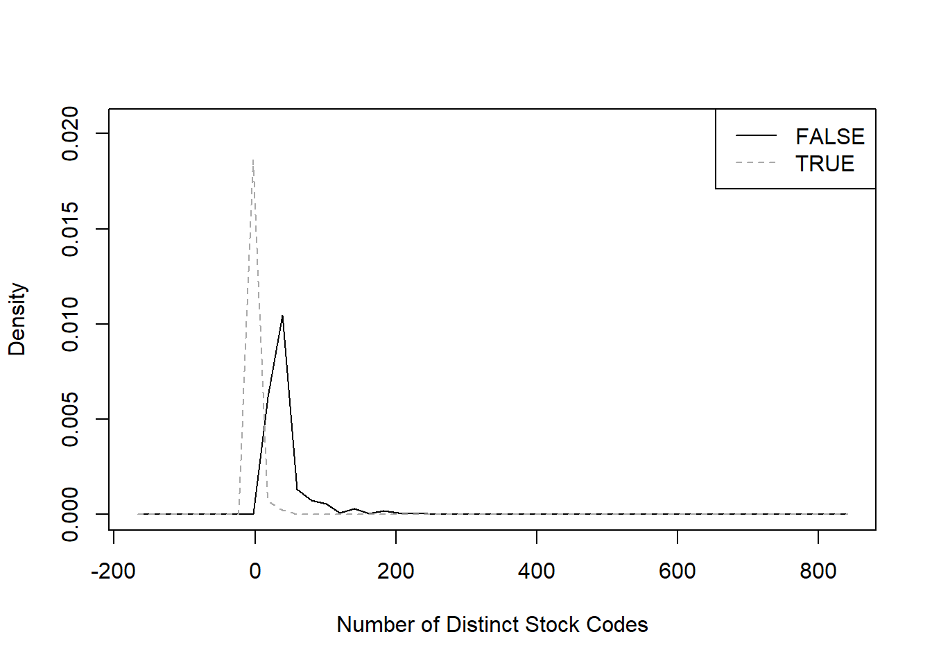
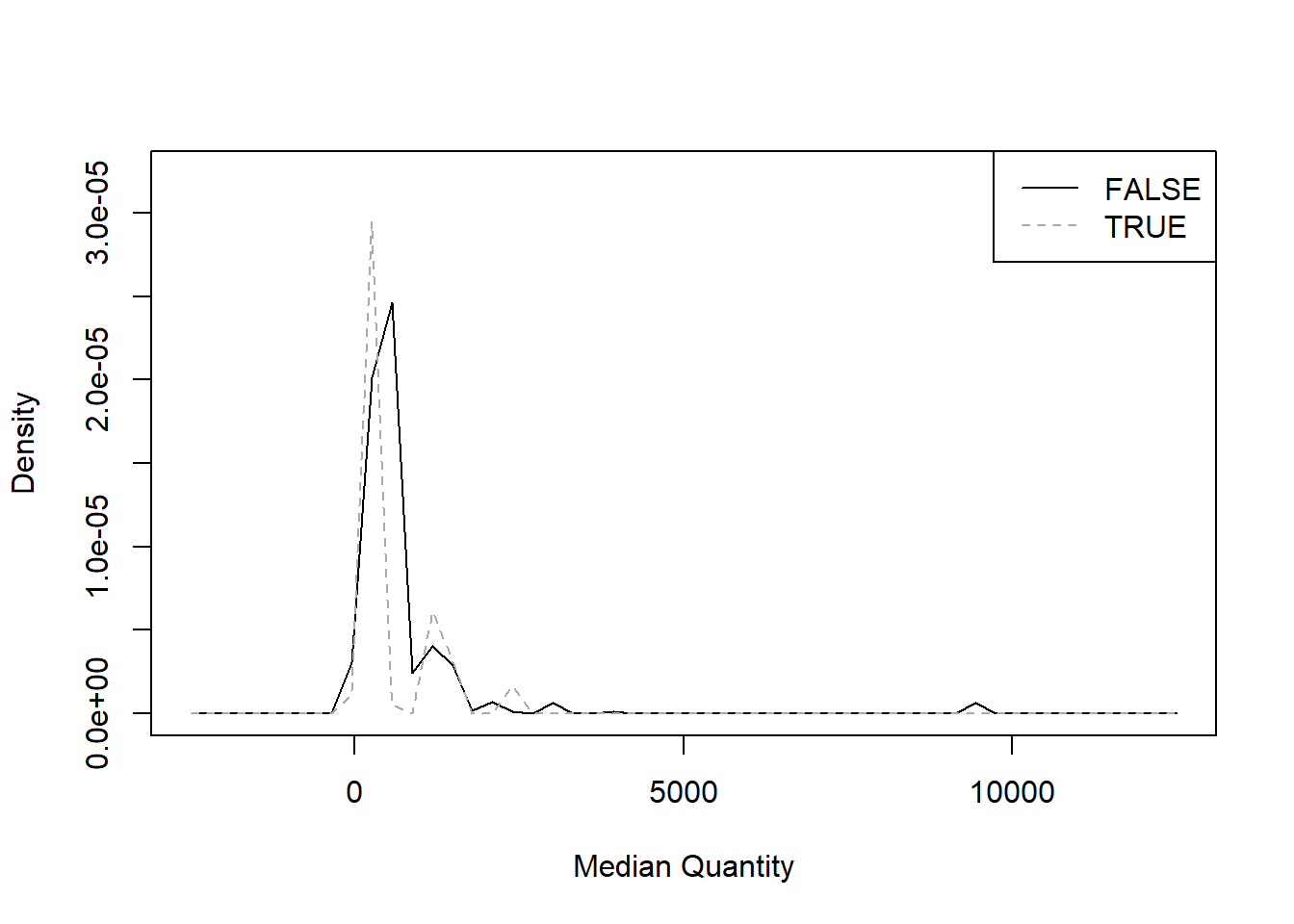
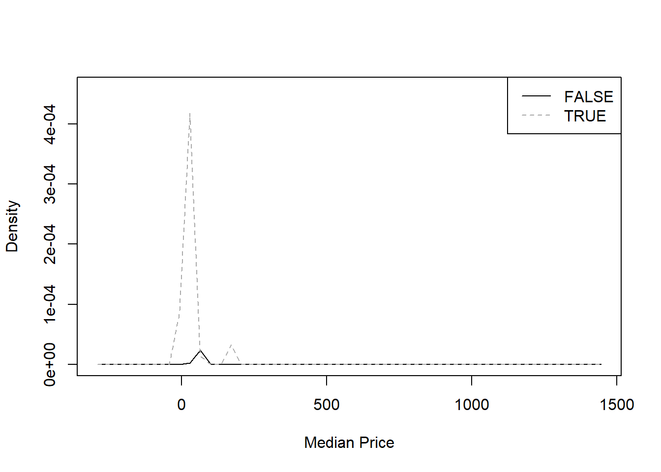
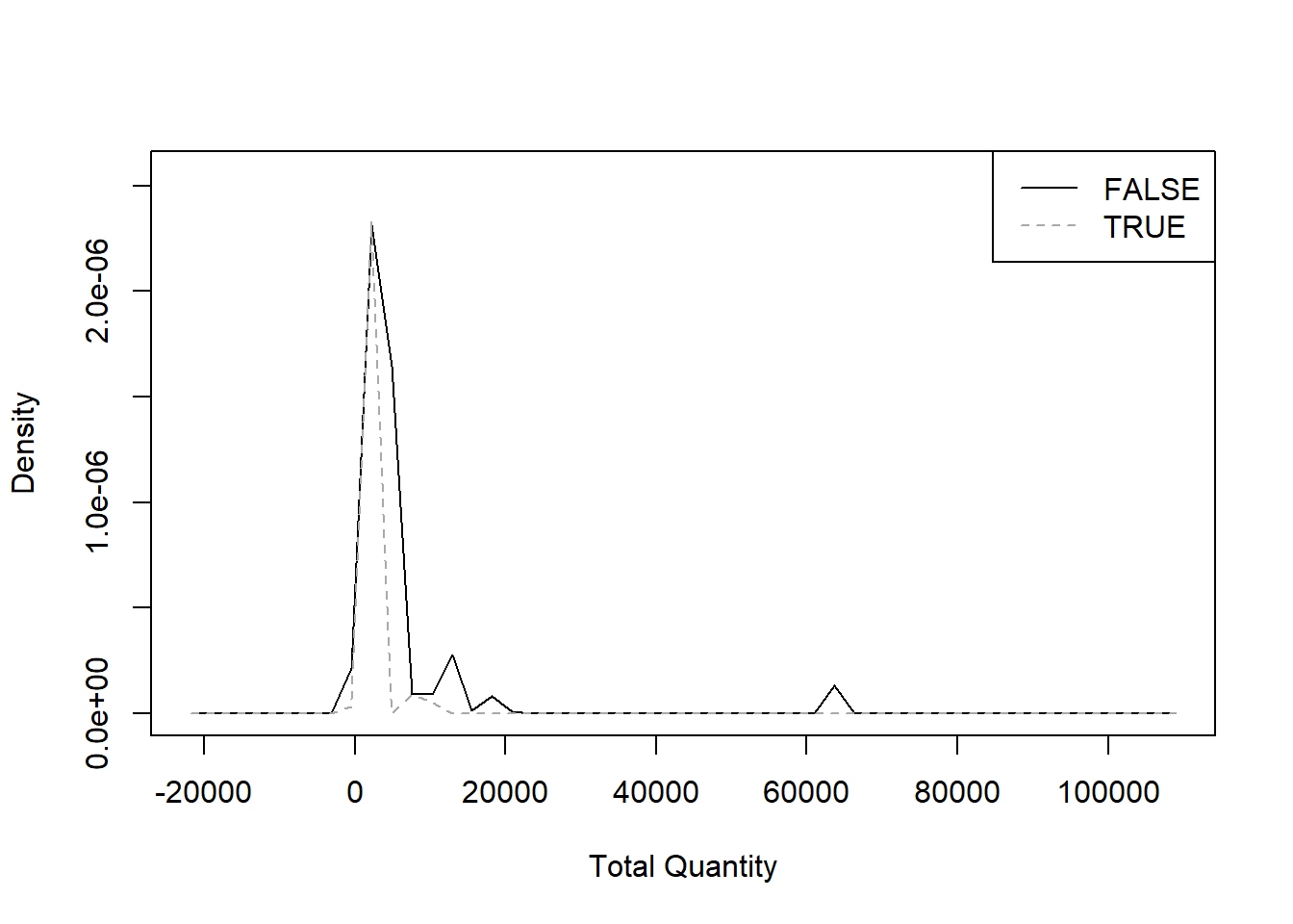
From this next series of graphics we can assess on whether the
metrics we chose are appropriate: a metric is appropriate when the
distribution of values between the statuses
Cancellation FALSE and Cancellation TRUE is
distinct, in this way the algorithm can use it to distinguish the
two.
library(sm)
"Number of Distinct Stock Codes" <- treedf$`Number of Distinct Stock Codes`
sm.density.compare(`Number of Distinct Stock Codes`, treedf$Cancellation, col = c("black", "darkgrey"))
legend("topright", levels(treedf$Cancellation), lty = c(1, 2), col = c("black", "darkgrey"))
"Median Quantity" <- treedf$`Median Quantity`
sm.density.compare(`Median Quantity`, treedf$Cancellation, col = c("black", "darkgrey"))
legend("topright", levels(treedf$Cancellation), lty = c(1, 2), col = c("black", "darkgrey"))
"Median Price" <- treedf$`Median Price`
sm.density.compare(`Median Price`, treedf$Cancellation, col = c("black", "darkgrey"))
legend("topright", levels(treedf$Cancellation), lty = c(1, 2), col = c("black", "darkgrey"))
"Total Quantity" <- treedf$`Total Quantity`
sm.density.compare(`Total Quantity`, treedf$Cancellation, col = c("black", "darkgrey"))
legend("topright", levels(treedf$Cancellation), lty = c(1, 2), col = c("black", "darkgrey"))
"Total Revenues" <- treedf$`Total Revenues`
sm.density.compare(`Total Revenues`, treedf$Cancellation, col = c("black", "darkgrey"))
legend("topright", levels(treedf$Cancellation), lty = c(1, 2), col = c("black", "darkgrey"))
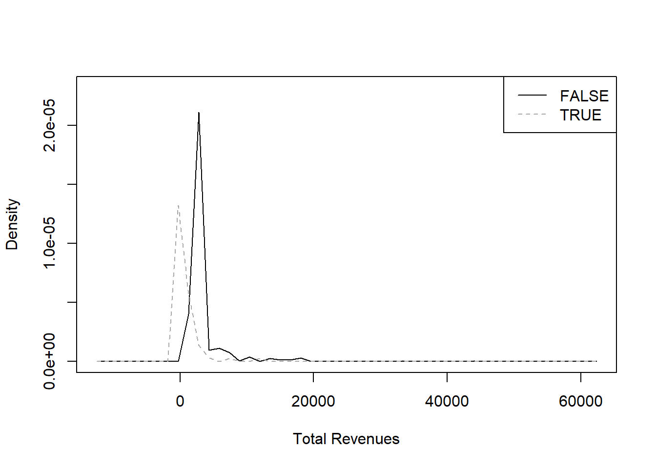
From the metrics we chose, it seems that only
Number of Distinct Items and Total Revenues
provide two sufficiently distinct curves.
- running the model
After those preliminary considerations, let’s run the model.
library(rpart)
model<- rpart(Cancellation ~ ., data = treedf[-1])
printcp(model)
Classification tree:
rpart(formula = Cancellation ~ ., data = treedf[-1])

Variables actually used in tree construction:
[1] Number of Distinct Stock Codes Total Quantity

Root node error: 4107/24680 = 0.16641

n= 24680

        CP nsplit rel error  xerror     xstd
1 0.371317      0   1.00000 1.00000 0.014247
2 0.036766      1   0.62868 0.63672 0.011773
3 0.010957      2   0.59192 0.59484 0.011424
4 0.010000      3   0.58096 0.59021 0.011384
The model returned two metrics that can influence the cancellations:
Number of Distinct Stock Codes and
Total Quantity.
We can investigate how these metrics affect cancellations in the
following table: for example 70% of the invoices with a
Total Quantity lower than 10 and a
Number of Distinct Stock Codes less than 6
have been cancelled.
library(rpart.plot)
rpart.rules(model, style = "tall")
Cancellation is 0.04 when
    Total Quantity >= 16

Cancellation is 0.29 when
    Total Quantity < 10
    Number of Distinct Stock Codes >= 6

Cancellation is 0.42 when
    Total Quantity is 10 to 16

Cancellation is 0.70 when
    Total Quantity < 10
    Number of Distinct Stock Codes < 6
One of the perks of this method is the possibility to plot the
decision tree itself,
rpart.plot(model, box.palette = 0)
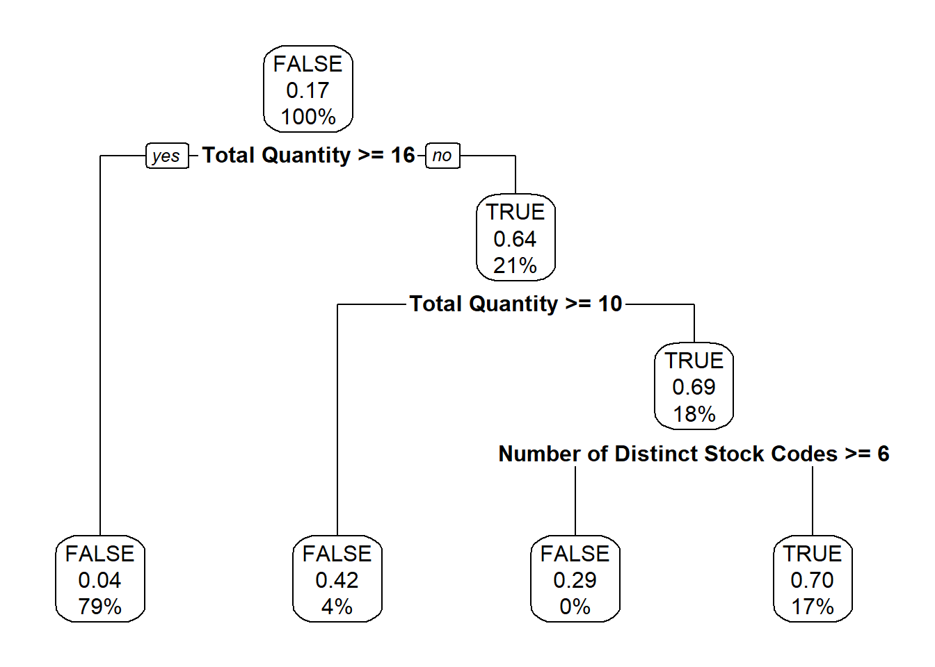
and that really helps in communicating the results.
In the plotted tree, its every node (meaning where the separations
happen) and leaf (the terminal nodes, with no separations) contain
information about:
- the majority of statuses present (
FALSE for the first
node, meaning the whole data set)
- the percentage of
Cancellation TRUE (0.17,
rounded, for the first node, as noted at the beginning of this
document)
- the percentage of invoices present in the node (thus
100% for the first one).
So the algorithm didn’t find perfect separations between the two
cases as there are, for example in the leftmost leaf, 4% of
invoices still being cancelled despite having a
Total Quantity higher than 16.
- main takeaways and further developments
This basic demonstration of a decision tree yielded the results that
small invoices are more likely to be cancelled.
To progress this analysis we can start by modifying the parameters of
the algorithm from the standard ones, then changing the metrics (for
example by adding chronological and/or geographical ones) or running
more models on the different subsets of customers
and countries
we discovered in previous documents.
When we are satisfied with the model, we can test its reliability by
applying it on future invoices, to estimate their probability of being
cancelled.