We will continue here, with a snappier exposition, in the same vein
as in the previous document, focusing this time on the
Price column, whose values have this distribution.
- preliminary inspection
We will here inspect the highest
df %>%
  arrange(desc(Price)) %>%
  relocate(InvoiceDate, .after = Price)
and lowest values of the column, to see if we spot some bizarre
entries.
df %>%
  arrange(Price)  %>%
  relocate(InvoiceDate, .after = Price)
From the most expensive purchases, the item
FLAG OF ST GEORGE CAR FLAG, purchases 65
times, seems to have a high variability in price,
df %>%
  filter(StockCode == "84016")
with 0.42 being the most regular one but we can also
encounter values of 1157.15.
df %>%
  filter(StockCode == "84016") %>%
  count(Price, sort = TRUE, name = "Number of Occurrences")
These high values are somehow concentrated in the middle of the
year.
library(ggplot2)
df %>%
  filter(StockCode == "84016") %>%
  ggplot(aes(InvoiceDate, Price)) +
  geom_point() +
  labs(x = NULL,
       y = NULL,
       title = "Prices of Purchases for StockCode 84016 (FLAG OF ST GEORGE CAR FLAG) \n along the Time Period")
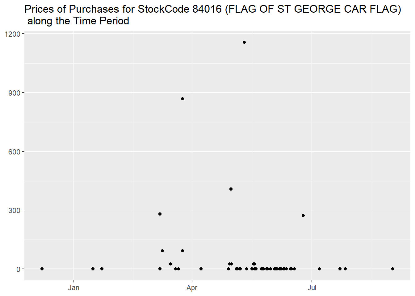
And, interestingly enough, they are not associated to any
CustomerID, while the lower ones, except 5
instances, all are.
df %>%
  filter(StockCode == "84016") %>%
  count(Price, CustomerID, name = "Number of Occurrences") %>%
  arrange(desc(Price))
They don’t seem typos, but transactions we don’t have enough
information about. As their presence doesn’t modify the values of the
upper and lower bounds returned by the formulas, we will not remove
them, but it is important that we are aware of their existence going
forward.
But we will still eliminate the rows of cancelled invoices, even if
they also don’t change the values of the bounds, as their substantial
number can modify many percentages, plus, as we discussed in the
previous document, we find more correct to consider cancelled invoices
as they never existed for the goals of this analysis.
- upper outliers
The number returned by the formula is then 8.65,
df_outlier <- df %>%
  filter(Quantity >= 0)
"Price Upper Bound" <- unname(quantile(df_outlier$Price, probs = 0.75) + 1.5 * (quantile(df_outlier$Price, probs = 0.75) - quantile(df_outlier$Price, probs = 0.25)))
library(knitr)
kable(tibble(`Price Upper Bound`), align = "l")
so, mirroring the analysis we did for the Quantity
column, we can start by evaluating how many purchases reached higher
prices.
df_outlier %>%
  mutate("Upper Outlier" = if_else(Price > `Price Upper Bound`, TRUE, FALSE)) %>%
  summarise("Total of Purchases" = n(),
            "Upper Outliers" = sum(`Upper Outlier`),
            "Percentage of Upper Outliers" = formattable::percent(mean(`Upper Outlier`)))
We continue then with this table of items sorted by the most
frequently highly priced,
df_outlier %>%
  mutate("Upper Outlier" = if_else(Price > `Price Upper Bound`, TRUE, FALSE)) %>%
  group_by(StockCode, Description) %>%
  summarise("Rounded Median Price" = round(median(Price), 0),
            "Number of Purchases" = n(),
            "Percentage of Upper Outliers" = formattable::percent(mean(`Upper Outlier`)), .groups = "drop") %>%
  arrange(desc(`Percentage of Upper Outliers`))
then showing its distribution of
Percentage of Upper Outliers, first with a table
df_outlier %>%
  mutate("Upper Outlier" = if_else(Price > `Price Upper Bound`, TRUE, FALSE)) %>%
  group_by(StockCode, Description) %>%
  summarise("Percentage of Upper Outliers" = formattable::percent(mean(`Upper Outlier`)), .groups = "drop") %>%
  count(`Percentage of Upper Outliers`, name = "Number of Distinct Items", sort = TRUE) %>%
  mutate("Percentage of Items" = formattable::percent(`Number of Distinct Items` / sum(`Number of Distinct Items`)))
and then with a graph, where we binned the percentages into
100 different buckets.
df_outlier %>%
  mutate("Upper Outlier" = if_else(Price > `Price Upper Bound`, TRUE, FALSE)) %>%
  group_by(StockCode, Description) %>%
  summarise("Percentage of Upper Outliers" = mean(`Upper Outlier`), .groups = "drop") %>%
  ggplot(aes(`Percentage of Upper Outliers`)) +
  geom_histogram(bins = 100) +
  scale_x_continuous(labels = scales::label_percent()) +
  labs(x = NULL,
       y = NULL,
       title = "Number of Distinct Items for Integer Percentages of Upper Outliers Purchases")
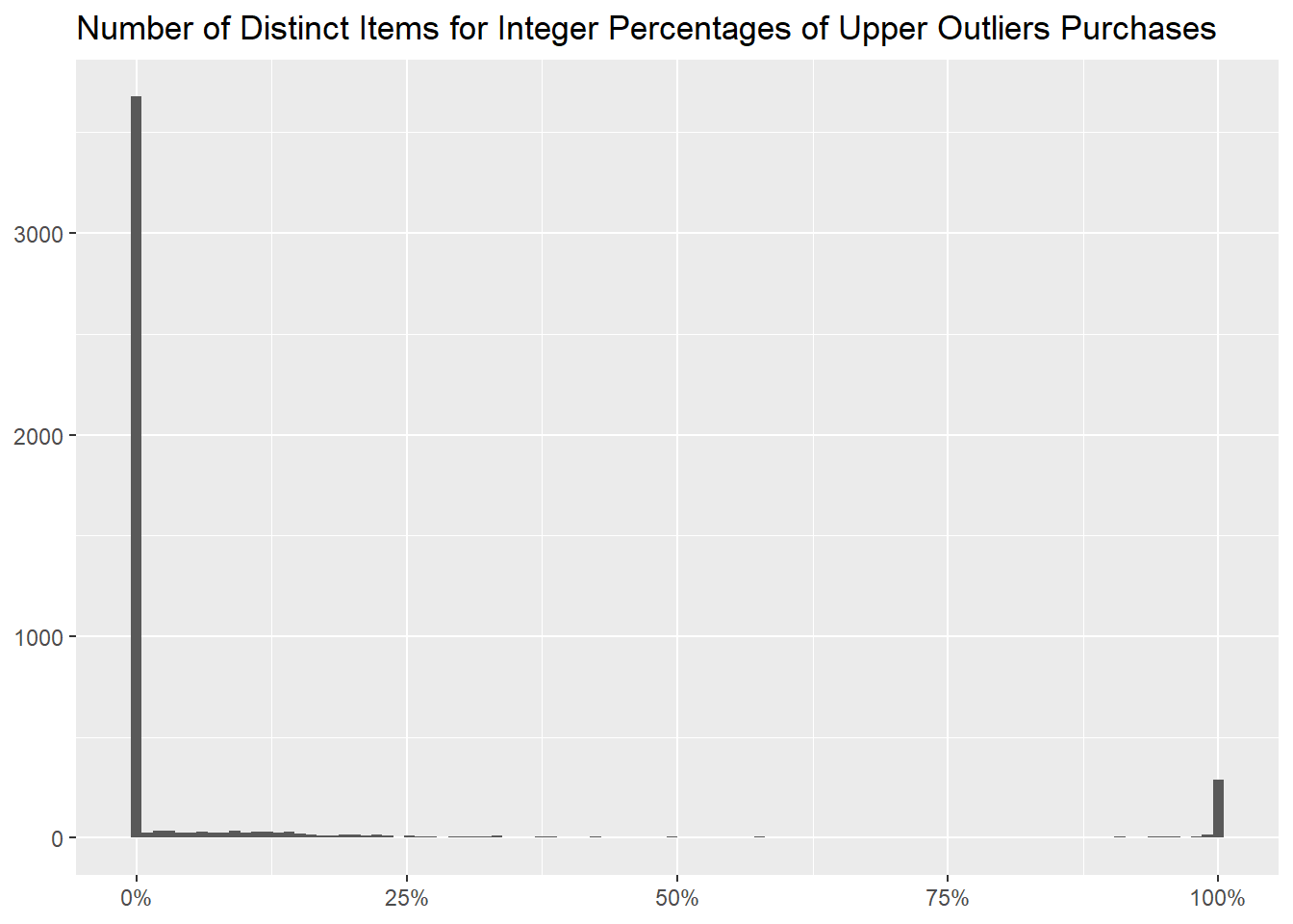
We notice that highly priced items are sold in small quantities.
df_outlier %>%
  mutate("Upper Outlier" = if_else(Price > `Price Upper Bound`, TRUE, FALSE)) %>%
  group_by(StockCode, Description) %>%
  mutate("Percentage of Upper Outliers" = mean(`Upper Outlier`),
         "100% Upper Outlier" = if_else(`Percentage of Upper Outliers` == 1, TRUE, FALSE)) %>%
  ungroup() %>%
  count(`100% Upper Outlier`, wt = round(median(Quantity), 2), name = "Rounded Median Quantity")
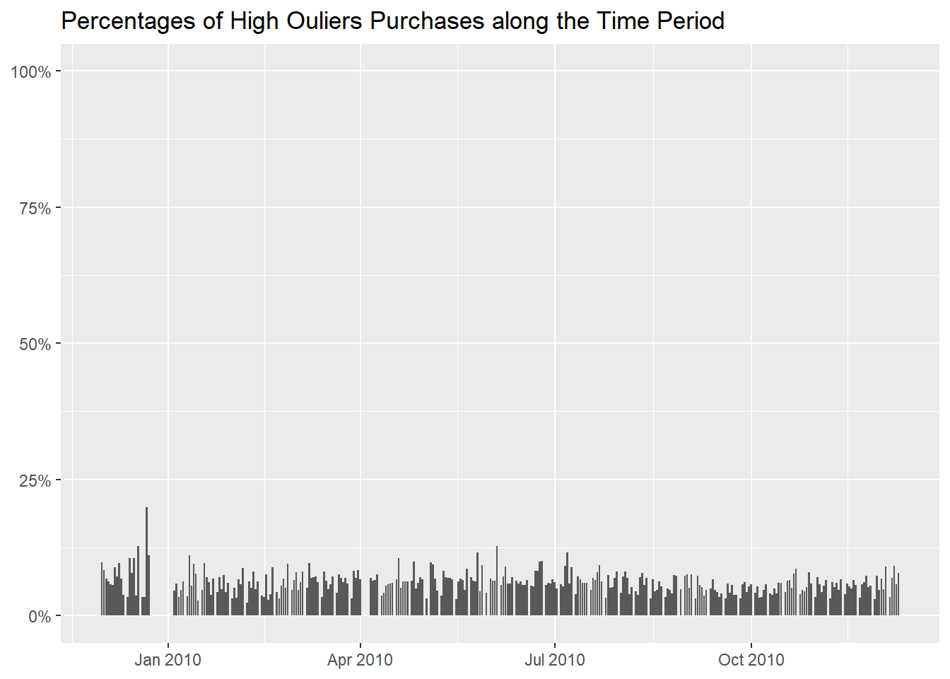
We proceed to determine if there are some days where the purchase of
highly priced item is more common.
df_outlier %>%
  mutate("Upper Outlier" = if_else(Price > `Price Upper Bound`, TRUE, FALSE)) %>%
  group_by(InvoiceDay = as.Date(InvoiceDate)) %>%
  summarise("Rounded Median Price" = round(median(Price), 0),
            "Number of Purchases" = n(),
            "Percentage of Upper Outliers" = formattable::percent(mean(`Upper Outlier`))) %>%
  arrange(desc(`Percentage of Upper Outliers`))
Now with a graph, to better show that they happen more frequently
before the Christmas break.
df_outlier %>%
  mutate("Upper Outlier" = if_else(Price > `Price Upper Bound`, TRUE, FALSE)) %>%
  group_by(InvoiceDay = as.Date(InvoiceDate)) %>%
  summarise("Percentage of High Outliers" = mean(`Upper Outlier`)) %>%
  ggplot(aes(InvoiceDay, `Percentage of High Outliers`)) +
  geom_col() +
  scale_y_continuous(labels = scales::label_percent(), limits = c(0, 1)) +
  labs(x = NULL,
       y = NULL,
       title = "Percentages of High Ouliers Purchases along the Time Period")
But it is also possible that items are priced higher before
Christmas,
df_outlier %>%
  mutate(Christmas = if_else(as.Date(InvoiceDate) < "2009-12-22", "Median Price Before Christmas", "Median Price After Christmas")) %>%
  group_by(StockCode, Description, Christmas) %>%
  summarise("Median Price" = median(Price), .groups = "drop") %>%
  tidyr::pivot_wider(names_from = Christmas, values_from = `Median Price`) %>%
  mutate("More Expensive before Christmas?" = if_else(`Median Price Before Christmas` > `Median Price After Christmas`, "Yes", "No"), .after = Description,
         "More Expensive before Christmas?" = coalesce(`More Expensive before Christmas?`, "missing information"),
         across(where(is.numeric), ~ coalesce(as.character(.x), "never sold")))
and that is true for 794 stock codes out of
4691.
df_outlier %>%
  mutate(Christmas = if_else(as.Date(InvoiceDate) < "2009-12-22", "Median Price Before Christmas", "Median Price Following Christmas")) %>%
  group_by(StockCode, Description, Christmas) %>%
  summarise("Median Price" = median(Price), .groups = "drop") %>%
  tidyr::pivot_wider(names_from = Christmas, values_from = `Median Price`) %>%
  mutate("More Expensive before Christmas?" = if_else(`Median Price Before Christmas` > `Median Price Following Christmas`, "Yes", "No"), .after = Description,
         "More Expensive before Christmas?" = coalesce(`More Expensive before Christmas?`, "missing information"),
         across(where(is.numeric), ~ coalesce(as.character(.x), "never sold"))) %>%
  count(`More Expensive before Christmas?`, name = "Number of Distinct Items")
This table shows how frequently each customer bought highly priced
items,
df_outlier %>%
  mutate("Upper Outlier" = if_else(Price > `Price Upper Bound`, TRUE, FALSE)) %>%
  group_by(CustomerID) %>%
  summarise("Rounded Median Price" = round(median(Price), 0),
            "Number of Purchases" = n(),
            "Percentage of Upper Outliers" = formattable::percent(mean(`Upper Outlier`))) %>%
  arrange(desc(`Percentage of Upper Outliers`), desc(`Number of Purchases`))
while this one how many of them there are for every percentage.
df %>%
  mutate("Upper Outlier" = if_else(Price > `Price Upper Bound`, TRUE, FALSE)) %>%
  group_by(CustomerID) %>%
  summarise("Percentage of Upper Outliers" = formattable::percent(mean(`Upper Outlier`))) %>%
  count(`Percentage of Upper Outliers`, name = "Number of Customers", sort = TRUE) %>%
  mutate("Percentage of Customers" = formattable::percent(`Number of Customers` / sum(`Number of Customers`)))
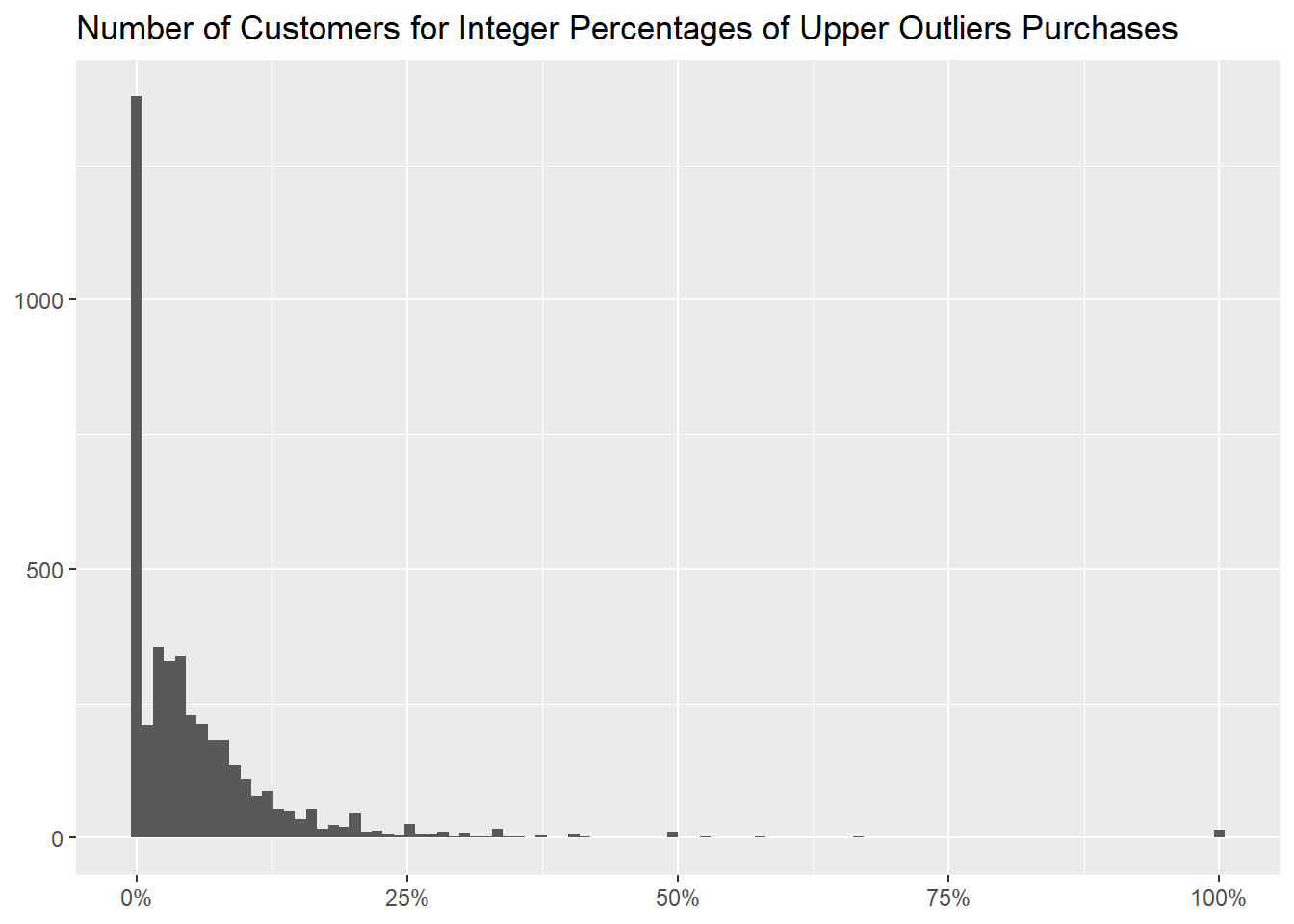
In this graph we binned every aforementioned percentage into 100
buckets, to show the number of customer for each of them.
df_outlier %>%
  mutate("Upper Outlier" = if_else(Price > `Price Upper Bound`, TRUE, FALSE)) %>%
  group_by(CustomerID) %>%
  summarise("Percentage of Upper Outliers" = mean(`Upper Outlier`)) %>%
  ggplot(aes(`Percentage of Upper Outliers`)) +
  geom_histogram(bins = 100) +
  scale_x_continuous(labels = scales::label_percent()) +
  labs(x = NULL,
       y = NULL,
       title = "Number of Customers for Integer Percentages of Upper Outliers Purchases")
About the countries, we didn’t find any that mainly buys highly
priced items.
df %>%
  mutate("Upper Outlier" = if_else(Price > `Price Upper Bound`, TRUE, FALSE)) %>%
  group_by(Country) %>%
  summarise("Number of Purchases" = n(),
            "Percentage of Upper Outliers" = formattable::percent(mean(`Upper Outlier`))) %>%
  arrange(desc(`Percentage of Upper Outliers`))
- lower outliers
for the lower outliers, as their bound is a negative number,
`Price Lower Bound` <- unname(quantile(df_outlier$Price, probs = 0.25) - 1.5 * (quantile(df_outlier$Price, probs = 0.75) - quantile(df_outlier$Price, probs = 0.25)))
kable(tibble(`Price Lower Bound`), align = "l")
we picked an arbitrary value of 1.25 (the first
quartile).
Let’s proceed then as we did with the upper outliers, first looking
at how many of these low priced purchases there are,
df_outlier %>%
  mutate("Low Priced" = if_else(Price < 1.25, TRUE, FALSE)) %>%
  summarise("Total of Purchases" = n(),
            "Low Priced Purchases" = sum(`Low Priced`),
            "Percentage of Low Priced Purchases" = formattable::percent(mean(`Low Priced`)))
and then at what items are most commonly sold at these prices.
df_outlier %>%
  mutate("Low Priced" = if_else(Price < 1.25, TRUE, FALSE)) %>%
  group_by(StockCode, Description) %>%
  summarise("Rounded Median Price" = round(median(Price), 2),
            "Number of Purchases" = n(),
            "Percentage of Low Priced Purchases" = formattable::percent(mean(`Low Priced`)), .groups = "drop") %>%
  arrange(desc(`Percentage of Low Priced Purchases`))
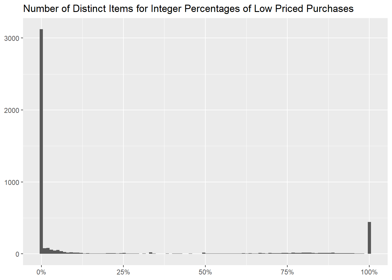
The distribution, like for the upper outliers, has two values that
are much more common,
df_outlier %>%
  mutate("Low Priced" = if_else(Price < 1.25, TRUE, FALSE)) %>%
  group_by(StockCode, Description) %>%
  summarise("Percentage of Low Priced Purchases" = formattable::percent(mean(`Low Priced`)), .groups = "drop") %>%
  count(`Percentage of Low Priced Purchases`, name = "Number of Distinct Items", sort = TRUE) %>%
  mutate("Percentage of Distinct Items" = formattable::percent(`Number of Distinct Items` / sum(`Number of Distinct Items`)))
as it is more easily seen by the following graph, with the
percentages binned into 100 values.
df_outlier %>%
  mutate("Low Priced" = if_else(Price < 1.25, TRUE, FALSE)) %>%
  group_by(StockCode, Description) %>%
  summarise("Percentage of Low Priced Purchases" = mean(`Low Priced`), .groups = "drop") %>%
  ggplot(aes(`Percentage of Low Priced Purchases`)) +
  geom_histogram(bins = 100) +
  scale_x_continuous(labels = scales::label_percent()) +
  labs(x = NULL,
       y = NULL,
       title = "Number of Distinct Items for Integer Percentages of Low Priced Purchases")
As before, their median quantity is different from the other items,
this time being higher.
df_outlier %>%
  mutate("Low Priced" = if_else(Price < 1.25, TRUE, FALSE)) %>%
  group_by(StockCode, Description) %>%
  mutate("Percentage of Low Priced Purchases" = formattable::percent(mean(`Low Priced`)),
         "100% Low Priced Purchase" = if_else(`Percentage of Low Priced Purchases` == 1, TRUE, FALSE)) %>%
  ungroup() %>%
  count(`100% Low Priced Purchase`, wt = round(median(Quantity), 2), name = "Rounded Median Quantity")
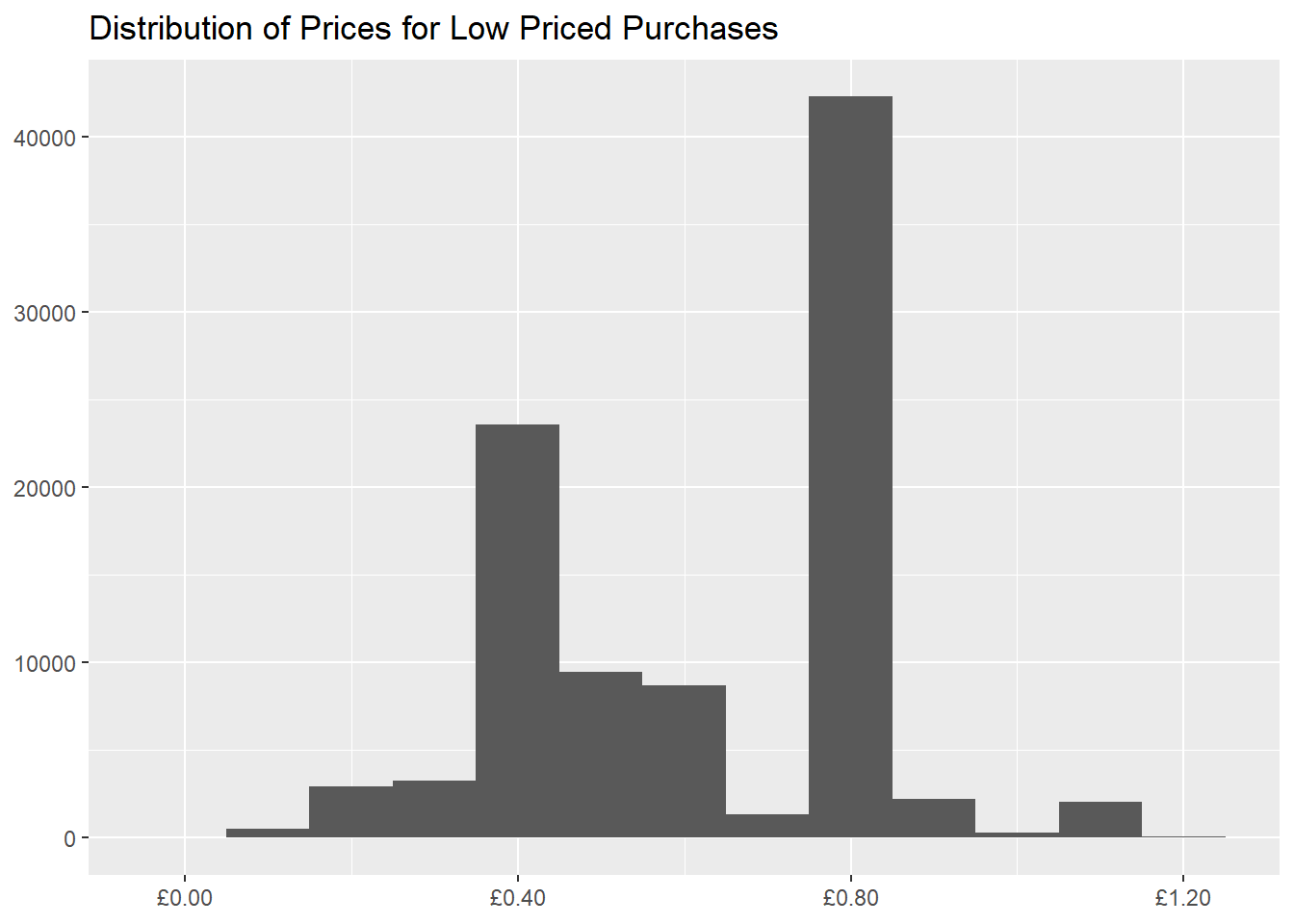
For this subset we are examining, two values of Price
are more common (0.4 and 0.8).
df_outlier %>%
  filter(Price < 1.25) %>%
  ggplot(aes(Price)) +
  geom_histogram(binwidth = 0.1) +
  scale_x_continuous(labels = scales::label_dollar(prefix = "£")) +
  labs(x = NULL,
       y = NULL,
       title = "Distribution of Prices for Low Priced Purchases")
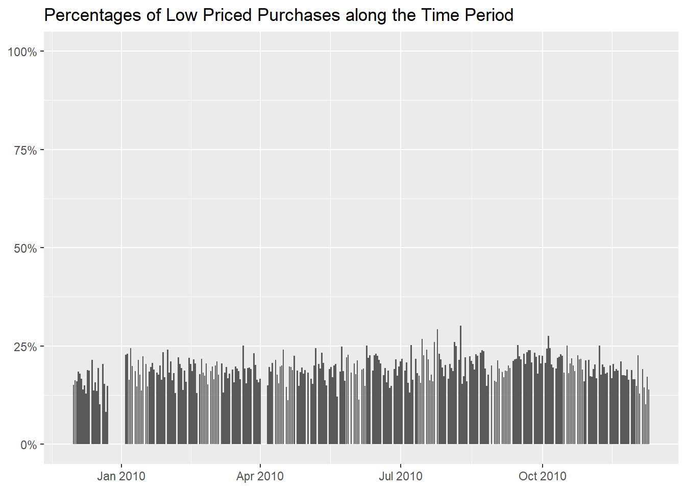
On a temporal scale, it seems that low priced items are bought evenly
during the year, without any particular spikes (reminder that our
retailer caters to wholesalers).
df_outlier %>%
  mutate("Low Priced" = if_else(Price < 1.25, TRUE, FALSE)) %>%
  group_by(InvoiceDay = as.Date(InvoiceDate)) %>%
  summarise("Rounded Median Price" = round(median(Price), 2),
            "Number of Purchases" = n(),
            "Percentage of Low Priced Purchases" = formattable::percent(mean(`Low Priced`))) %>%
  arrange(desc(`Percentage of Low Priced Purchases`))
df_outlier %>%
  mutate("Low Priced" = if_else(Price < 1.25, TRUE, FALSE)) %>%
  group_by(InvoiceDay = as.Date(InvoiceDate)) %>%
  summarise("Percentage of Low Priced Purchases" = mean(`Low Priced`)) %>%
  ggplot(aes(InvoiceDay, `Percentage of Low Priced Purchases`)) +
  geom_col() +
  scale_y_continuous(labels = scales::label_percent(), limits = c(0, 1)) +
  labs(x = NULL,
       y = NULL,
       title = "Percentages of Low Priced Purchases along the Time Period")
About the customers, we can here identify the ones that buy low
priced items more often,
df_outlier %>%
  mutate("Low Priced" = if_else(Price < 1.25, TRUE, FALSE)) %>%
  group_by(CustomerID) %>%
  summarise("Rounded Median Price" = round(median(Price), 2),
            "Number of Purchases" = n(),
            "Percentage of Low Priced Purchases" = formattable::percent(mean(`Low Priced`))) %>%
  arrange(desc(`Percentage of Low Priced Purchases`))
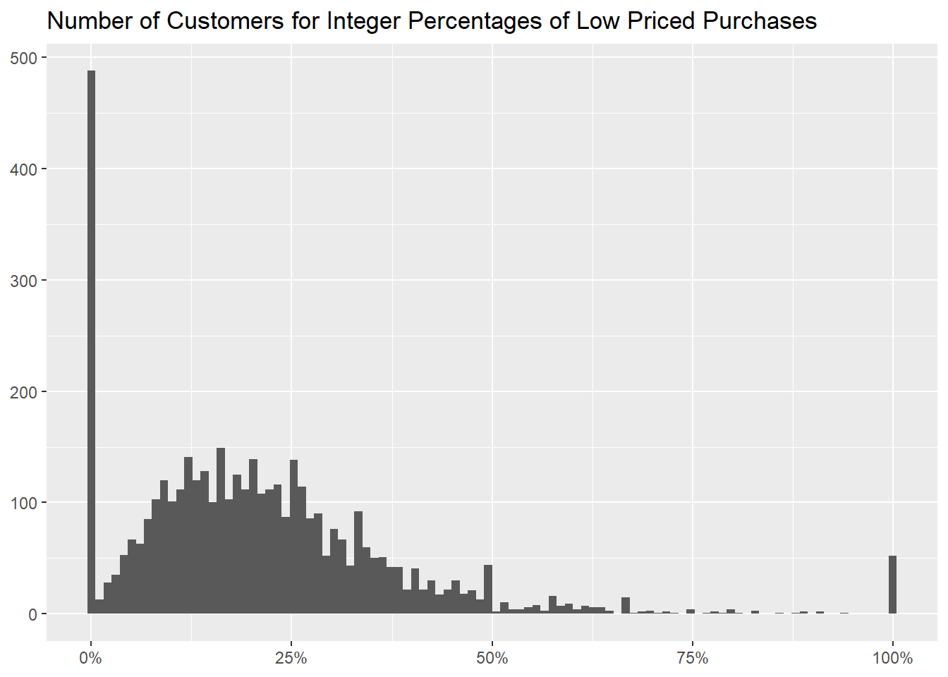
and hereafter show how many of them there are for every percentage of
low priced purchases,
df_outlier %>%
  mutate("Low Priced" = if_else(Price < 1.25, TRUE, FALSE)) %>%
  group_by(CustomerID) %>%
  summarise("Percentage of Low Priced Purchases" = formattable::percent(mean(`Low Priced`))) %>%
  count(`Percentage of Low Priced Purchases`, name = "Number of Customers", sort = TRUE)
with the usual graph of binned percentages.
df_outlier %>%
  mutate("Low Priced" = if_else(Price < 1.25, TRUE, FALSE)) %>%
  group_by(CustomerID) %>%
  summarise("Percentage of Low Priced Purchases" = mean(`Low Priced`)) %>%
  ggplot(aes(`Percentage of Low Priced Purchases`)) +
  geom_histogram(bins = 100) +
  scale_x_continuous(labels = scales::label_percent()) +
  labs(x = NULL,
       y = NULL,
       title = "Number of Customers for Integer Percentages of Low Priced Purchases")
Focusing on the countries, we don’t notice any that buys low priced
items the majority of times.
df_outlier %>%
  mutate("Low Priced" = if_else(Price < 1.25, TRUE, FALSE)) %>%
  group_by(Country) %>%
  summarise("Number of Purchases" = n(),
            "Percentage of Low Priced Purchases" = formattable::percent(mean(`Low Priced`))) %>%
  arrange(desc(`Percentage of Low Priced Purchases`))
- main takeaways
FLAG OF ST GEORGE CAR FLAG is an item with a strange price pattern,
about the rest, as we did with the Quantity column, we
built an understanding of the most common occurrences for both the
highly and low priced purchases, returning many tables that can be used
to direct business decisions, but we didn’t discover any additional very
peculiar instances worth investigating further.