- introduction
We will now proceed to study outliers, that is those numerical values
that are either much bigger or much smaller than the others. They are
very interesting to investigate as they can provide insights about
particular cases that don’t commonly happen and furthermore they are a
way to spot typos in data entry.
We only have two numeric columns in our data frame,
Quantity and Price, and this is their
distribution of values,
df %>%
  reframe(across(where(is.numeric), ~ summary(.x)))  %>%
  mutate(Statistic = c("Min.", "1st Qu.", "Median", "Mean", "3rd Qu.", "Max"), .before = Quantity)
One definition for an outlier is when its value it’s either
smaller/greater than the first/third quartile minus/plus
1.5 times the interquartile range.
Lower Outliers < 1st Quartile - 1.5 * (3rd Quartile - 1st Quartile)
Upper Outliers > 3rd Quartile + 1.5 * (3rd Quartile - 1st Quartile)
So for example for the following set of values,
(x <- c(0, 1, 2, 4, 5, 5, 5, 5, 5, 5, 5, 6, 8, 9, 10))
## [1] 0 1 2 4 5 5 5 5 5 5 5 6 8 9 10
these are the lower and upper bounds, the cutoff points beyond which
a value is defined as an outlier:
"Lower Bound" <- quantile(x, probs = 0.25) - 1.5 * (quantile(x, probs = 0.75) - quantile(x, probs = 0.25))
"Upper Bound" <- quantile(x, probs = 0.75) + 1.5 * (quantile(x, probs = 0.75) - quantile(x, probs = 0.25))
tibble(`Lower Bound`, `Upper Bound`)
Consequently, these are the values defined as lower
## [1] 0 1 2
and upper outliers
## [1] 8 9 10
for that set of values.
We will use this method for defining outliers as it is the most used
in statistics, but with some business knowledge we could use as well
more specific values as cutoff points, like thresholds determined by how
many items can fit into a box, the number of items by which the
transportation costs increase and so on and so forth.
- upper outliers
Let’s calculate the upper bound for the outliers then, but before we
will remove the rows with a negative value in the Quantity
column, as those purchases have been cancelled so we feel that it would
be wrong to consider them in the calculation.
df_outlier <- df %>%
  filter(Quantity > 0)
"Quantity Upper Bound" <- unname(quantile(df_outlier$Quantity, probs = 0.75) + 1.5 * (quantile(df_outlier$Quantity, probs = 0.75) - quantile(df_outlier$Quantity, probs = 0.25)))
library(knitr)
kable(tibble(`Quantity Upper Bound`), align = "l")
So we obtained a upper bound value of 26 units, let’s
see then how many purchases are upper outliers ones,
df_outlier %>%
  mutate("Upper Outlier" = if_else(Quantity > `Quantity Upper Bound`, TRUE, FALSE)) %>%
  summarise("Total of Purchases" = n(),
            "Upper Outliers" = sum(`Upper Outlier`),
            "Percentage of Upper Outliers" = formattable::percent(mean(`Upper Outlier`)))
and what items are more frequently sold in quantities higher than the
upper bound.
df_outlier %>%
  mutate("Upper Outlier" = if_else(Quantity > `Quantity Upper Bound`, TRUE, FALSE)) %>%
  group_by(StockCode, Description) %>%
  summarise("Rounded Median Quantity" = round(median(Quantity), 0),
            "Number of Purchases" = n(),
            "Percentage of Upper Outliers" = formattable::percent(mean(`Upper Outlier`)), .groups = "drop") %>%
  arrange(desc(`Percentage of Upper Outliers`))
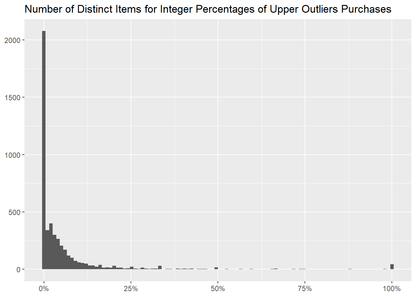
The following table shows how many distinct items we have for every
percentage of upper outliers purchases; for 100% we have
43, a small number, but not negligible as it is the second
most popular.
df_outlier %>%
  mutate("Upper Outlier" = if_else(Quantity > `Quantity Upper Bound`, TRUE, FALSE)) %>%
  group_by(StockCode, Description) %>%
  summarise("Percentage of Upper Outliers" = mean(`Upper Outlier`), .groups = "drop") %>%
  count(`Percentage of Upper Outliers`, name = "Number of Distinct Items", sort = TRUE) %>%
  mutate(`Percentage of Upper Outliers` = formattable::percent(`Percentage of Upper Outliers`),
         "Percentage of Distinct Items" = formattable::percent(`Number of Distinct Items` / sum(`Number of Distinct Items`)))
As we can see as well from the following histogram, where we grouped
Percentage of Upper Outliers in 100 bins, one
for every integer percentage.
library(ggplot2)
df_outlier %>%
  mutate("Upper Outlier" = if_else(Quantity > `Quantity Upper Bound`, TRUE, FALSE)) %>%
  group_by(StockCode, Description) %>%
  summarise("Percentage of Upper Outliers" = mean(`Upper Outlier`), .groups = "drop") %>%
  ggplot(aes(`Percentage of Upper Outliers`)) +
  geom_histogram(bins = 100) +
  scale_x_continuous(labels = scales::label_percent()) +
  labs(x = NULL,
       y = NULL,
       title = "Number of Distinct Items for Integer Percentages of Upper Outliers Purchases")
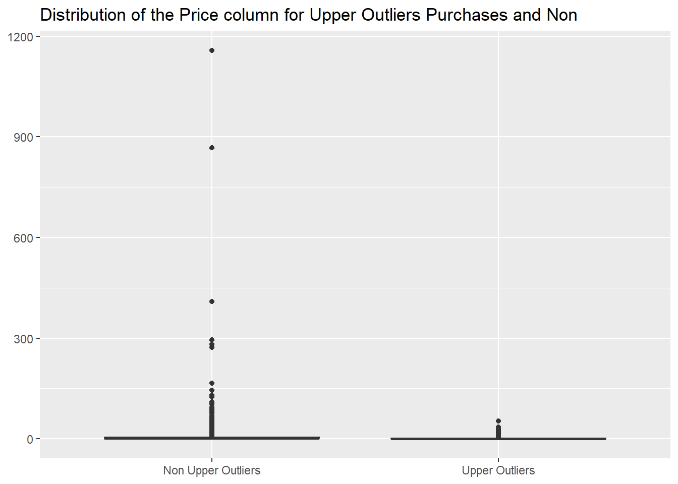
We discover as well that the items always sold in higher quantities
have a median price that is much lower than the one of the other
items.
df_outlier %>%
  mutate("Upper Outlier" = if_else(Quantity > `Quantity Upper Bound`, TRUE, FALSE)) %>%
  group_by(StockCode, Description) %>%
  mutate("Percentage of Upper Outliers" = mean(`Upper Outlier`),
         "100% Upper Outlier" = if_else(`Percentage of Upper Outliers` == 1, TRUE, FALSE)) %>%
  ungroup() %>%
  count(`100% Upper Outlier`, wt = round(median(Price), 2), name = "Rounded Median Price")
In fact the most expensive item of this group costs
52.78,
kable(df_outlier %>%
        filter(Quantity > `Quantity Upper Bound`) %>%
        summarise("Upper Outliers Highest Price" = max(Price)), align = "l")
while for items sold in minor quantities we see, from the following
graph, many values higher than that.
df_outlier %>%
  mutate("Upper Outlier" = if_else(Quantity > `Quantity Upper Bound`, "Upper Outliers", "Non Upper Outliers")) %>%
  ggplot(aes(`Upper Outlier`, Price)) +
  geom_boxplot() +
  labs(x = NULL,
       y = NULL,
       title = "Distribution of the Price column for Upper Outliers Purchases and Non")
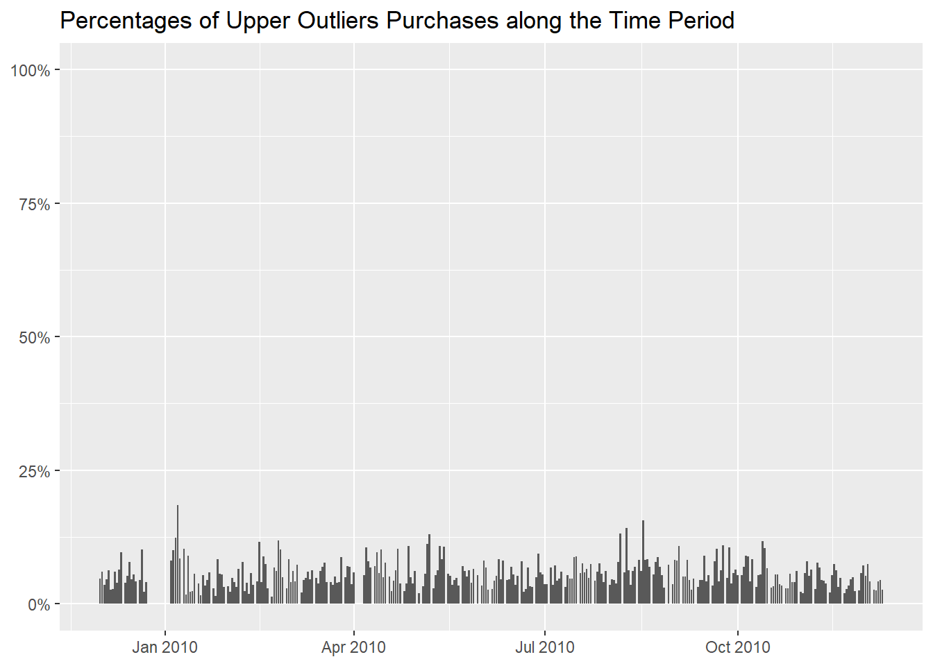
We can then analogously proceed to determine if there are some days
where the purchases of high quantities is more common,
df_outlier %>%
  mutate("Upper Outlier" = if_else(Quantity > `Quantity Upper Bound`, TRUE, FALSE)) %>%
  group_by(InvoiceDay = as.Date(InvoiceDate)) %>%
  summarise("Rounded Median Quantity" = round(median(Quantity), 0),
            "Number of Purchases" = n(),
            "Percentage of Upper Outliers" = formattable::percent(mean(`Upper Outlier`))) %>%
  arrange(desc(`Percentage of Upper Outliers`))
and we notice higher percentages with the beginning of the
New Year and somewhere in August, but they are
not remarkably higher than the others.
df_outlier %>%
  mutate("Upper Outlier" = if_else(Quantity > `Quantity Upper Bound`, TRUE, FALSE)) %>%
  group_by(InvoiceDay = as.Date(InvoiceDate)) %>%
  summarise("Percentage of High Outliers" = mean(`Upper Outlier`)) %>%
  ggplot(aes(InvoiceDay, `Percentage of High Outliers`)) +
  geom_col() +
  scale_y_continuous(labels = scales::label_percent(), limits = c(0, 1)) +
  labs(x = NULL,
       y = NULL,
       title = "Percentages of Upper Outliers Purchases along the Time Period")
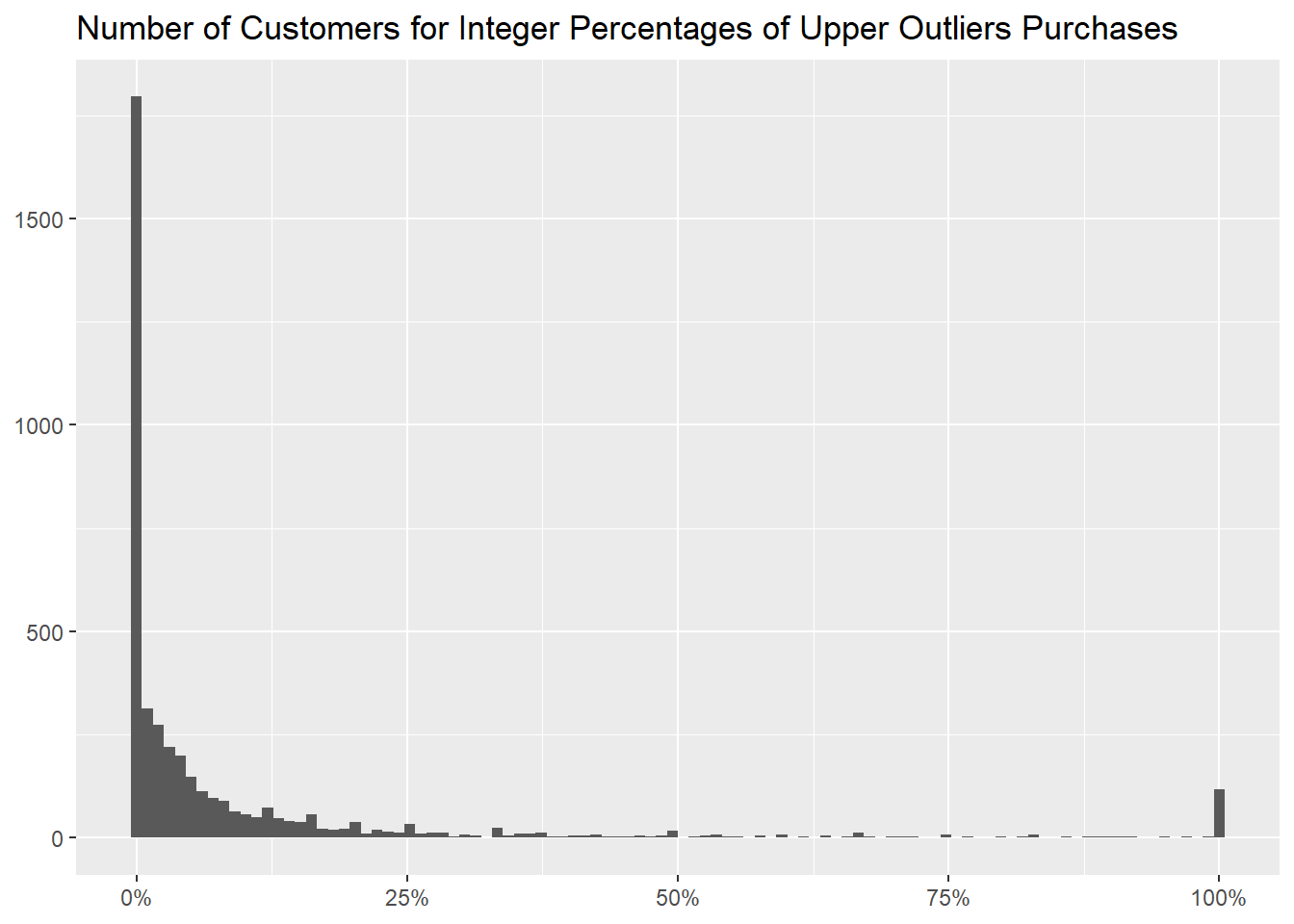
We can move to customers now, to identify the ones that buy in high
quantities more often,
df_outlier %>%
  mutate("Upper Outlier" = if_else(Quantity > `Quantity Upper Bound`, TRUE, FALSE)) %>%
  group_by(CustomerID) %>%
  summarise("Rounded Median Quantity" = round(median(Quantity), 0),
            "Number of Purchases" = n(),
            "Percentage of Upper Outliers" = formattable::percent(mean(`Upper Outlier`))) %>%
  arrange(desc(`Percentage of Upper Outliers`), desc(`Number of Purchases`))
and how many of them there are for every percentage, both as a
table
df_outlier %>%
  mutate("Upper Outliers" = if_else(Quantity > `Quantity Upper Bound`, TRUE, FALSE)) %>%
  group_by(CustomerID) %>%
  summarise("Percentage of Upper Outliers" = formattable::percent(mean(`Upper Outliers`))) %>%
  count(`Percentage of Upper Outliers`, name = "Number of Customers", sort = TRUE)
and as a graph.
df_outlier %>%
  mutate("Upper Outlier" = if_else(Quantity > `Quantity Upper Bound`, TRUE, FALSE)) %>%
  group_by(CustomerID) %>%
  summarise("Percentage of Upper Outliers" = mean(`Upper Outlier`)) %>%
  ggplot(aes(`Percentage of Upper Outliers`)) +
  geom_histogram(bins = 100) +
  scale_x_continuous(labels = scales::label_percent()) +
  labs(x = NULL,
       y = NULL,
       title = "Number of Customers for Integer Percentages of Upper Outliers Purchases")
Lastly, we can investigate the countries but we don’t notice any that
predominantly buys only larger quantities.
df_outlier %>%
  mutate("Upper Outlier" = if_else(Quantity > `Quantity Upper Bound`, TRUE, FALSE)) %>%
  group_by(Country) %>%
  summarise("Rounded Median Quantity" = round(median(Quantity), 0),
            "Number of Purchases" = n(),
            "Percentage of Upper Outliers" = formattable::percent(mean(`Upper Outlier`))) %>%
  arrange(desc(`Percentage of Upper Outliers`))
- lower outliers
Moving to the lower outliers, when we apply the formula it returns a
negative value,
`Quantity Lower Bound` <- unname(quantile(df_outlier$Quantity, probs = 0.25) - 1.5 * (quantile(df_outlier$Quantity, probs = 0.75) - quantile(df_outlier$Quantity, probs = 0.25)))
kable(tibble(`Quantity Lower Bound`), align = "l")
so we will pick the extreme (even more for a wholesaler) value of
Quantity equal to 1 to investigate purchases
of low quantity, recalling that in the previous
document we discovered as well that 44.67% of purchases
with said quantity had a missing value in the CustomerID
column.
Let’s proceed then as we did with the upper outliers, first looking
at how many of these unitary quantity purchases there are,
df_outlier %>%
  mutate("Unitary Quantity" = if_else(Quantity == 1, TRUE, FALSE)) %>%
  summarise("Total of Purchases" = n(),
            "Unitary Purchases" = sum(`Unitary Quantity`),
            "Percentage of Unitary Purchases" = formattable::percent(mean(`Unitary Quantity`)))
then what items are most commonly sold in this amount of
1
df_outlier %>%
  mutate("Unitary Quantity" = if_else(Quantity == 1, TRUE, FALSE)) %>%
  group_by(StockCode, Description) %>%
  summarise("Rounded Median Quantity" = round(median(Quantity), 0),
            "Number of Purchases" = n(),
            "Percentage of Unitary Quantity" = formattable::percent(mean(`Unitary Quantity`)), .groups = "drop") %>%
  arrange(desc(`Percentage of Unitary Quantity`))
and ultimately showing how many there are for every percentage.
df_outlier %>%
  mutate("Unitary Quantity" = if_else(Quantity == 1, TRUE, FALSE)) %>%
  group_by(StockCode, Description) %>%
  summarise("Percentage of Unitary Quantity Purchases" = mean(`Unitary Quantity`), .groups = "drop") %>%
  count(`Percentage of Unitary Quantity Purchases`, name = "Number of Distinct Items", sort = TRUE) %>%
  mutate("Percentage of Unitary Quantity Purchases" = formattable::percent(`Percentage of Unitary Quantity Purchases`),
         "Percentage of Distinct Items" = formattable::percent(`Number of Distinct Items` / sum(`Number of Distinct Items`)))
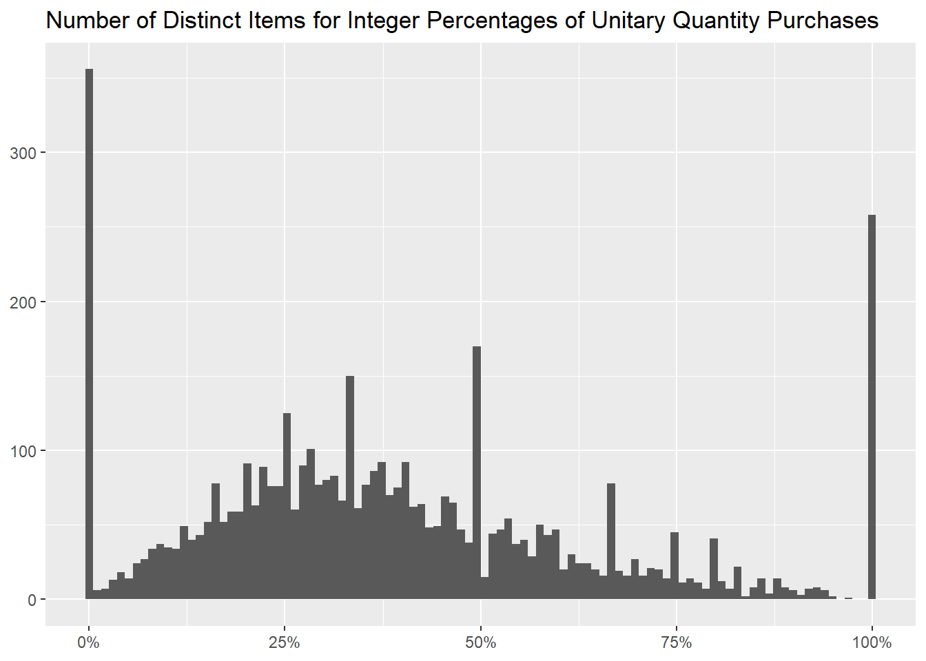
As before, we can bin the different percentages of upper outliers in
100 different brackets (one for each hundredth), to graph
how many items there are for each of them.
df_outlier %>%
  mutate("Unitary Quantity" = if_else(Quantity == 1, TRUE, FALSE)) %>%
  group_by(StockCode, Description) %>%
  summarise("Percentage of Unitary Quantity Purchases" = mean(`Unitary Quantity`), .groups = "drop") %>%
  ggplot(aes(`Percentage of Unitary Quantity Purchases`)) +
  geom_histogram(bins = 100) +
  scale_x_continuous(labels = scales::label_percent()) +
  labs(x = NULL,
       y = NULL,
       title = "Number of Distinct Items for Integer Percentages of Unitary Quantity Purchases")
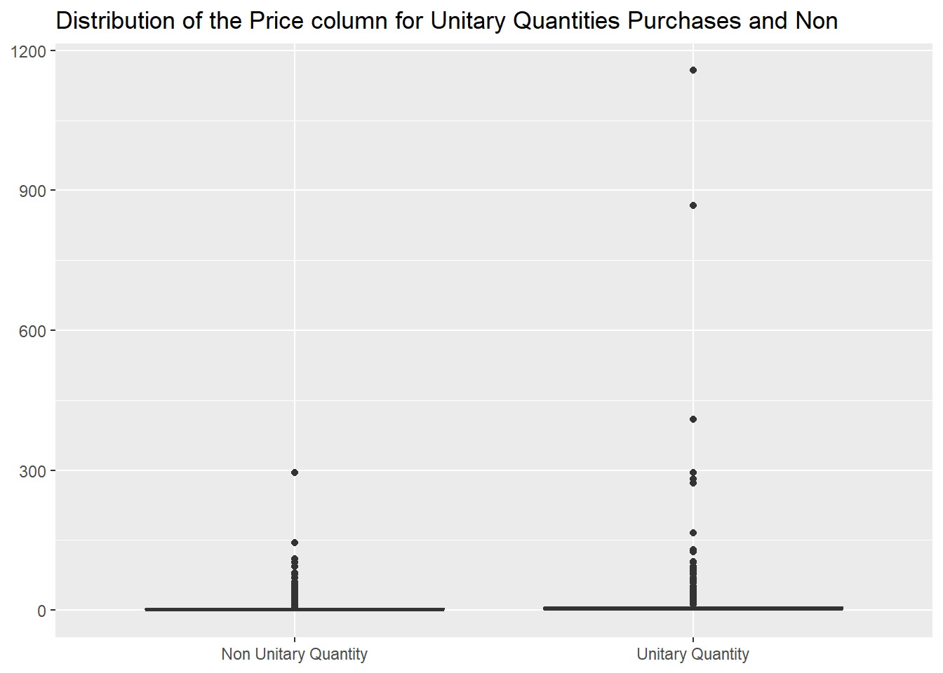
As before, their median price is different from the other items, this
time being higher.
df_outlier %>%
  mutate("Unitary Quantity" = if_else(Quantity == 1, TRUE, FALSE)) %>%
  group_by(StockCode, Description) %>%
  mutate("Percentage of Unitary Quantity Purchases" = mean(`Unitary Quantity`),
         "100% Unitary Quantity Purchase" = if_else(`Percentage of Unitary Quantity Purchases` == 1, TRUE, FALSE)) %>%
  ungroup() %>%
  count(`100% Unitary Quantity Purchase`, wt = round(median(Price), 2), name = "Rounded Median Price")
It is interesting that the value of 2.10 returns from a
previous table, and in fact the
distribution of values between the two sets is very similar
df_outlier %>%
  mutate("Upper Outlier" = if_else(Quantity > `Quantity Upper Bound`, TRUE, FALSE),
         "Unitary Quantity" = if_else(Quantity == 1, TRUE, FALSE)) %>%
  group_by(StockCode, Description) %>%
  mutate("Percentage of Upper Outliers" = mean(`Upper Outlier`),
         "Percentage of Unitary Quantity Purchases" = mean(`Unitary Quantity`)) %>%
  ungroup() %>%
  reframe("Not 100% Upper Outliers" = summary(Price[`Percentage of Upper Outliers` != 1]),
          "Not 100% Unitary Purchases" = summary(Price[`Percentage of Unitary Quantity Purchases` != 1])) %>%
  mutate("Statistic" = c("Min." , "1st Qu.", "Median", "Mean", "3rd Qu.", "Max."), .before = `Not 100% Upper Outliers`)
as there are only 146 rows from one set (the
Not 100% Unitary Purchases one) not present in the
other.
 df_outlier %>%
  mutate("Unitary Quantity" = if_else(Quantity == 1, TRUE, FALSE)) %>%
  group_by(StockCode, Description) %>%
  mutate("Percentage of Unitary Quantity Purchases" = mean(`Unitary Quantity`)) %>%
  ungroup() %>%
  filter(`Percentage of Unitary Quantity Purchases` != 1) %>%
  anti_join(df_outlier %>%
              mutate("Upper Outlier" = if_else(Quantity > `Quantity Upper Bound`, TRUE, FALSE)) %>%
              group_by(StockCode, Description) %>%
              mutate("Percentage of Upper Outliers" = mean(`Upper Outlier`)) %>%
              ungroup() %>%
              filter(`Percentage of Upper Outliers` != 1), by = c("Invoice", "StockCode", "Description", "Quantity", "InvoiceDate", "Price", "CustomerID", "Country"))
Going back to the prices, the distributions for the two cases are
very different.
df_outlier %>%
  mutate("Unitary Quantity" = if_else(Quantity == 1, "Unitary Quantity", "Non Unitary Quantity")) %>%
  ggplot(aes(`Unitary Quantity`, Price)) +
  geom_boxplot() +
  labs(x = NULL,
       y = NULL,
       title = "Distribution of the Price column for Unitary Quantities Purchases and Non")
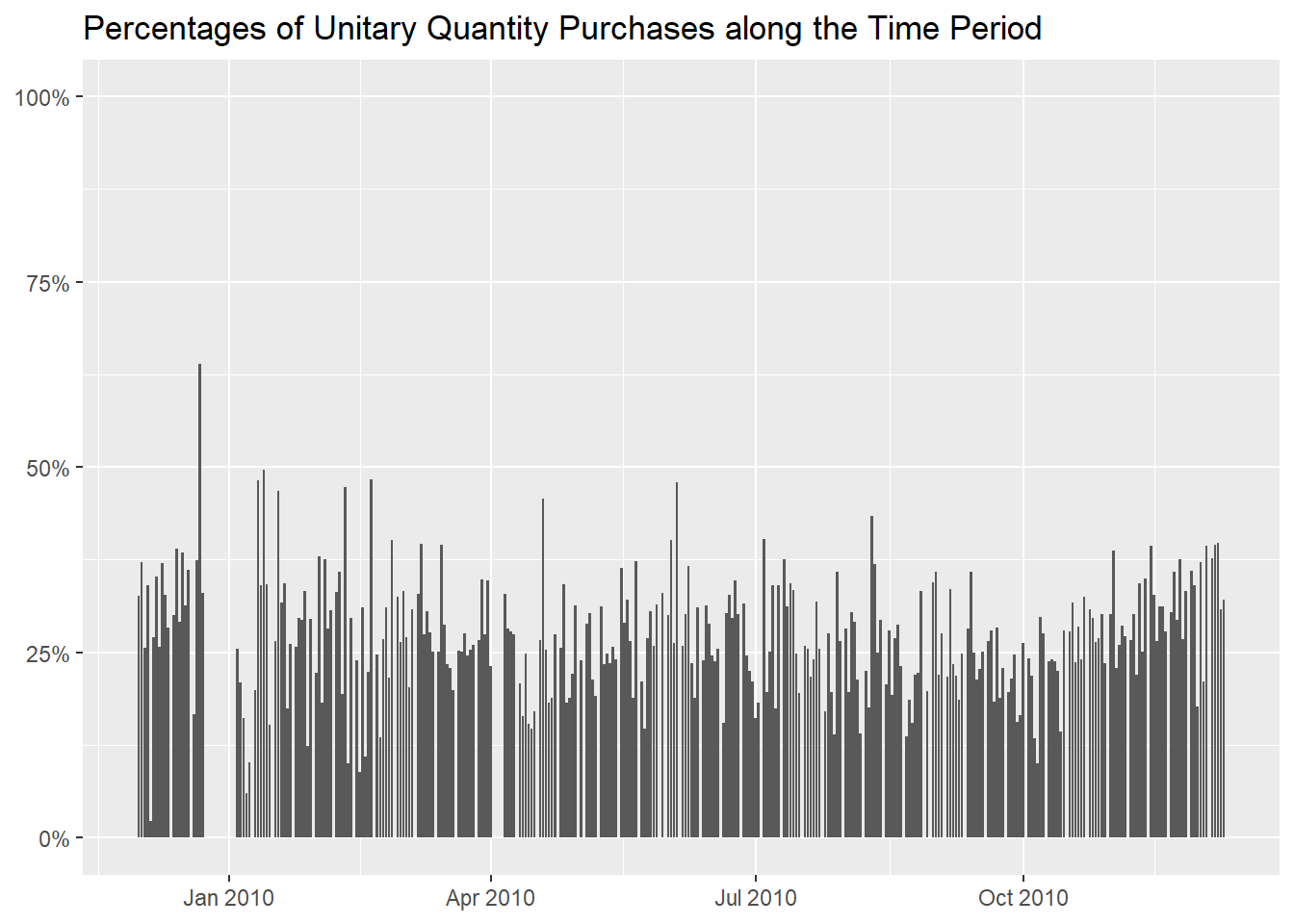
Let’s see the days now, and we notice a spike before the
Christmas holidays.
df_outlier %>%
  mutate("Unitary Quantity" = if_else(Quantity == 1, TRUE, FALSE)) %>%
  group_by(InvoiceDay = as.Date(InvoiceDate)) %>%
  summarise("Rounded Median Quantity" = round(median(Quantity), 0),
            "Number of Purchases" = n(),
            "Percentage of Unitary Quantity Purchases" = formattable::percent(mean(`Unitary Quantity`))) %>%
  arrange(desc(`Percentage of Unitary Quantity Purchases`))
df_outlier %>%
  mutate("Unitary Quantity" = if_else(Quantity == 1, TRUE, FALSE)) %>%
  group_by(InvoiceDay = as.Date(InvoiceDate)) %>%
  summarise("Percentage of Unitary Quantity Purchases" = mean(`Unitary Quantity`))  %>%
  ggplot(aes(InvoiceDay, `Percentage of Unitary Quantity Purchases`)) +
  geom_col() +
  scale_y_continuous(labels = scales::label_percent(), limits = c(0, 1)) +
  labs(x = NULL,
       y = NULL,
       title = "Percentages of Unitary Quantity Purchases along the Time Period")
About the customers, we can use this table to identify the ones that
buys in unitary quantities more often
df_outlier %>%
  mutate("Unitary Quantity" = if_else(Quantity == 1, TRUE, FALSE)) %>%
  group_by(CustomerID) %>%
  summarise("Rounded Median Quantity" = round(median(Quantity), 0),
            "Number of Purchases" = n(),
            "Percentage of Unitary Quantity Purchases" = formattable::percent(mean(`Unitary Quantity`))) %>%
  arrange(desc(`Percentage of Unitary Quantity Purchases`), desc(`Number of Purchases`))
and this one for how many of them there are for every percentage,
df_outlier %>%
  mutate("Unitary Quantity" = if_else(Quantity == 1, TRUE, FALSE)) %>%
  group_by(CustomerID) %>%
  summarise("Percentage of Unitary Quantity Purchases" = formattable::percent(mean(`Unitary Quantity`))) %>%
  count(`Percentage of Unitary Quantity Purchases`, name = "Number of Customers", sort = TRUE)
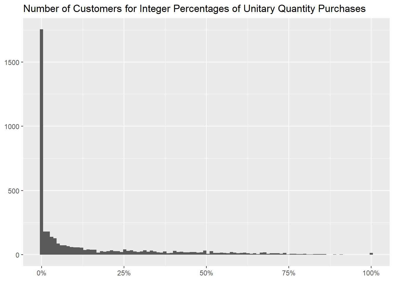
complementing with the usual graph of the aforementioned percentages
binned for every integer one of them.
df_outlier %>%
  mutate("Unitary Quantity" = if_else(Quantity == 1, TRUE, FALSE)) %>%
  group_by(CustomerID) %>%
  summarise("Percentage of Unitary Quantity Purchases" = mean(`Unitary Quantity`)) %>%
  ggplot(aes(`Percentage of Unitary Quantity Purchases`)) +
  geom_histogram(bins = 100) +
  scale_x_continuous(labels = scales::label_percent()) +
  labs(x = NULL,
       y = NULL,
       title = "Number of Customers for Integer Percentages of Unitary Quantity Purchases")
Lastly, we can investigate which countries buy in unitary quantities
and we don’t see any that does that predominantly, bar for
Nigeria.
df_outlier %>%
  mutate("Unitary Quantity" = if_else(Quantity == 1, TRUE, FALSE)) %>%
  group_by(Country) %>%
  summarise("Number of Purchases" = n(),
            "Percentage of Unitary Quantity Purchases" = formattable::percent(mean(`Unitary Quantity`))) %>%
  arrange(desc(`Percentage of Unitary Quantity Purchases`))
- removing missing customers
At the beginning of this section we mentioned how many unitary
purchases have the CustomerID column empty, so we decided
to retread this last analysis removing those purchases, to see if we
attain particularly different result.
df_outlier_noNAsCustomerID <- df_outlier %>%
  filter(!is.na(CustomerID))
We notice at first a significantly lower percentage of them
(19.63% compared to 28.30%).
df_outlier_noNAsCustomerID %>%
  mutate("Unitary Quantity" = if_else(Quantity == 1, TRUE, FALSE)) %>%
  summarise("Total of Purchases" = n(),
            "Unitary Purchases" = sum(`Unitary Quantity`),
            "Percentage of Unitary Purchases" = formattable::percent(mean(`Unitary Quantity`)))
We lose as well255 items,
df_outlier %>%
  mutate("Unitary Quantity" = if_else(Quantity == 1, TRUE, FALSE)) %>%
  group_by(StockCode, Description) %>%
  summarise("Rounded Median Quantity" = round(median(Quantity), 0),
            "Number of Purchases" = n(),
            "Percentage of Unitary Quantity" = formattable::percent(mean(`Unitary Quantity`)), .groups = "drop") %>%
  arrange(desc(`Percentage of Unitary Quantity`)) %>%
  anti_join(df_outlier_noNAsCustomerID %>%
              count(StockCode, Description), by = c("StockCode", "Description"))
evidently only present in purchases with a missing value in the
CustomerID column, amounting to 532
invoices.
df_outlier %>%
  semi_join(df_outlier %>%
              mutate("Unitary Quantity" = if_else(Quantity == 1, TRUE, FALSE)) %>%
              group_by(StockCode, Description) %>%
              summarise("Rounded Median Quantity" = round(median(Quantity), 0),
                        "Number of Purchases" = n(),
                        "Percentage of Unitary Quantity" = formattable::percent(mean(`Unitary Quantity`)), .groups = "drop") %>%
              anti_join(df_outlier_noNAsCustomerID %>%
                          count(StockCode, Description), by = c("StockCode", "Description")), by = c("StockCode", "Description")) %>%
  count(CustomerID, wt = n_distinct(Invoice), name = "Number of Invoices")
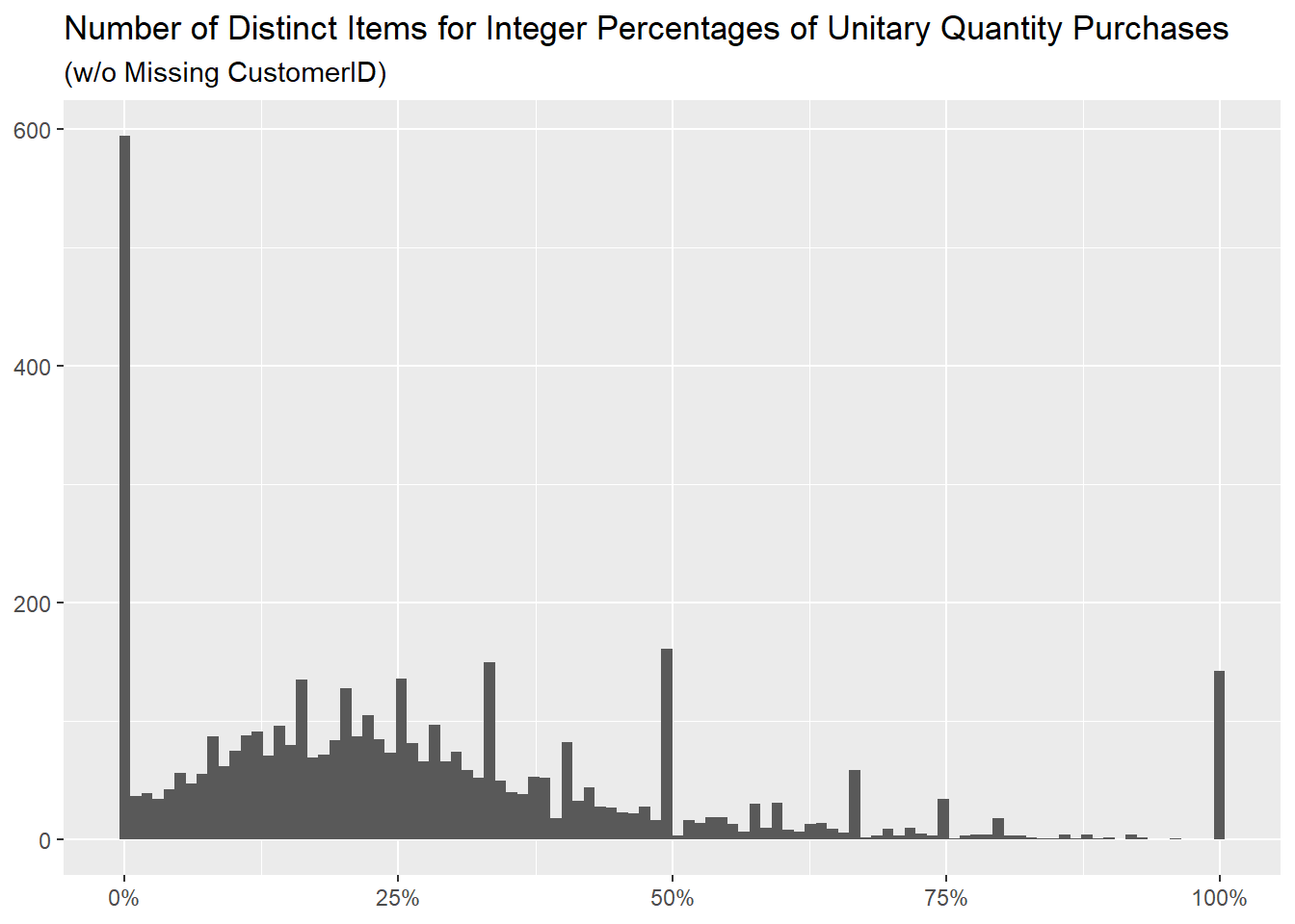
The distribution of percentages is similar, we just have more items
never sold at the Quantity of 1
(0.00% percentage) as we removed the invoices where it did
happen.
df_outlier_noNAsCustomerID %>%
  mutate("Unitary Quantity" = if_else(Quantity == 1, TRUE, FALSE)) %>%
  group_by(StockCode, Description) %>%
  summarise("Percentage of Unitary Quantity Purchases" = mean(`Unitary Quantity`), .groups = "drop") %>%
  count(`Percentage of Unitary Quantity Purchases`, name = "Number of Distinct Items", sort = TRUE) %>%
  mutate("Percentage of Unitary Quantity Purchases" = formattable::percent(`Percentage of Unitary Quantity Purchases`),
         "Percentage of Distinct Items" = formattable::percent(`Number of Distinct Items` / sum(`Number of Distinct Items`)))
df_outlier_noNAsCustomerID %>%
  mutate("Unitary Quantity" = if_else(Quantity == 1, TRUE, FALSE)) %>%
  group_by(StockCode, Description) %>%
  summarise("Percentage of Unitary Quantity Purchases" = mean(`Unitary Quantity`), .groups = "drop") %>%
  ggplot(aes(`Percentage of Unitary Quantity Purchases`)) +
  geom_histogram(bins = 100) +
  scale_x_continuous(labels = scales::label_percent()) +
  labs(x = NULL,
       y = NULL,
       title = "Number of Distinct Items for Integer Percentages of Unitary Quantity Purchases",
       subtitle = "(w/o Missing CustomerID)")
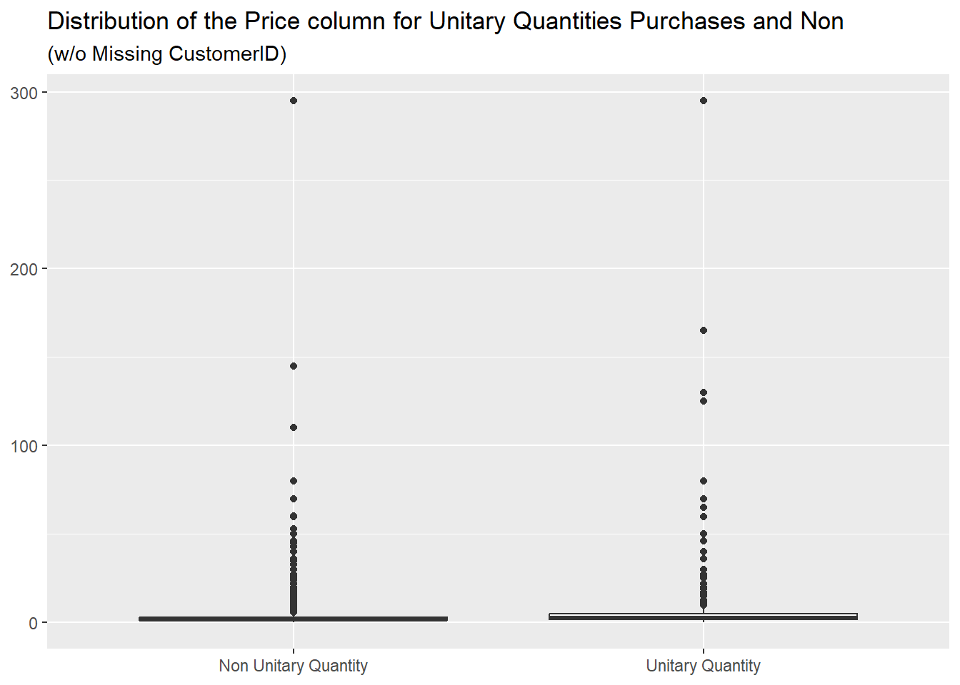
The spread between the median prices of the two sets is reduced from
2.10 / 4.21 to 1.95 /
2.95, with a decrease of more than one unit for the
100% Unitary Quantity Purchase one, meaning that the items
removed were more expensive,
df_outlier_noNAsCustomerID %>%
  mutate("Unitary Quantity" = if_else(Quantity == 1, TRUE, FALSE)) %>%
  group_by(StockCode, Description) %>%
  mutate("Percentage of Unitary Quantity Purchases" = mean(`Unitary Quantity`),
         "100% Unitary Quantity Purchase" = if_else(`Percentage of Unitary Quantity Purchases` == 1, TRUE, FALSE)) %>%
  ungroup() %>%
  count(`100% Unitary Quantity Purchase`, wt = round(median(Price), 2), name = "Rounded Median Price")
as we can see from this graph, where the distributions for the two
cases is very similar: removing the missing CustomerID
values we evidently removed all the items with a price higher than
300, present in the previous
one.
df_outlier_noNAsCustomerID %>%
  mutate("Unitary Quantity" = if_else(Quantity == 1, "Unitary Quantity", "Non Unitary Quantity")) %>%
  ggplot(aes(`Unitary Quantity`, Price)) +
  geom_boxplot() +
  labs(x = NULL,
       y = NULL,
       title = "Distribution of the Price column for Unitary Quantities Purchases and Non",
       subtitle = "(w/o Missing CustomerID)")
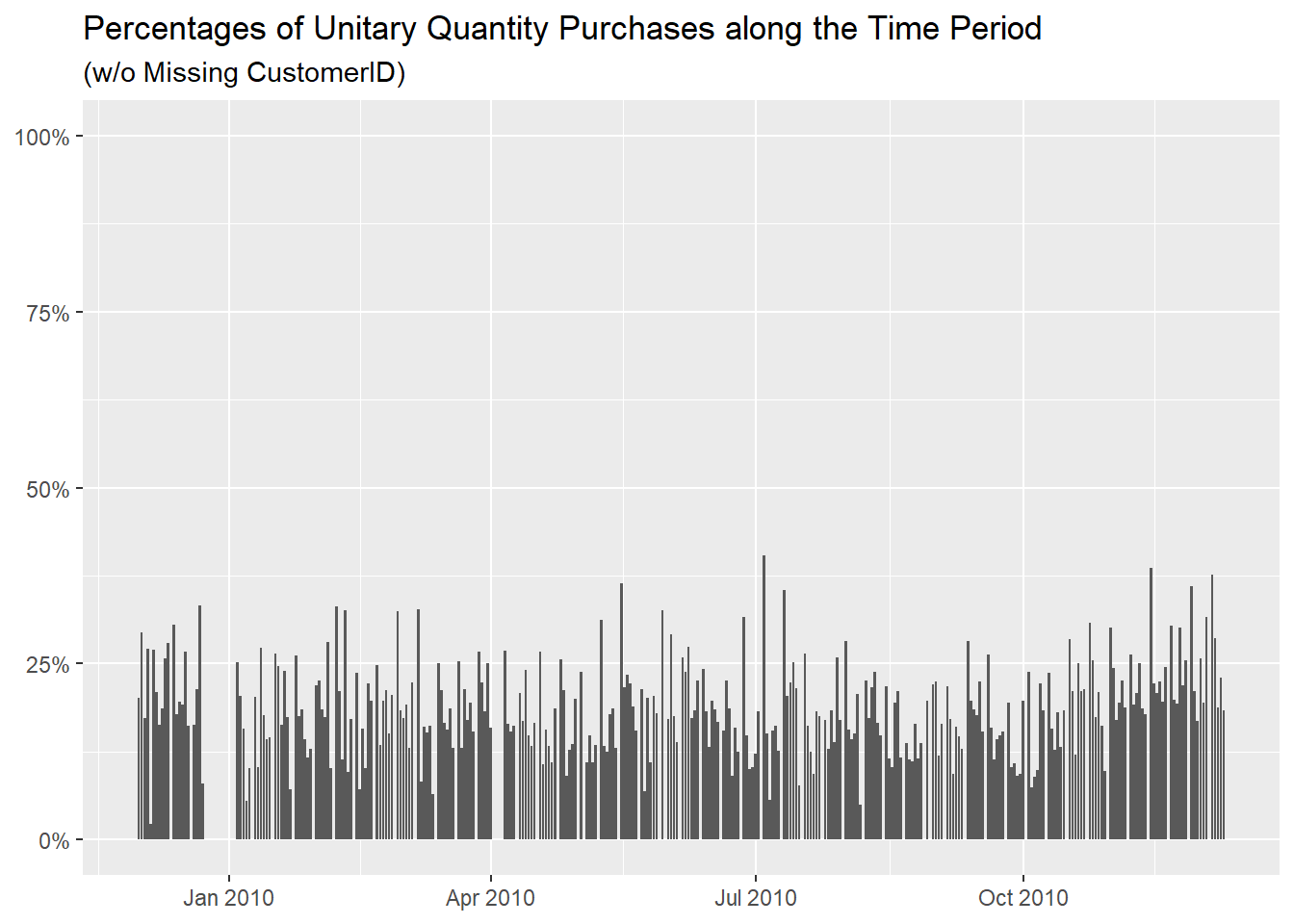
We also removed all the values higher than 40% in the
days’ breakdown, eliminating the spike before
Christmas.
df_outlier_noNAsCustomerID %>%
  mutate("Unitary Quantity" = if_else(Quantity == 1, TRUE, FALSE)) %>%
  group_by(InvoiceDay = as.Date(InvoiceDate)) %>%
  summarise("Rounded Median Quantity" = round(median(Quantity), 0),
            "Number of Purchases" = n(),
            "Percentage of Unitary Quantity Purchases" = formattable::percent(mean(`Unitary Quantity`))) %>%
  arrange(desc(`Percentage of Unitary Quantity Purchases`))
df_outlier_noNAsCustomerID %>%
  mutate("Unitary Quantity" = if_else(Quantity == 1, TRUE, FALSE)) %>%
  group_by(InvoiceDay = as.Date(InvoiceDate)) %>%
  summarise("Percentage of Unitary Quantity Purchases" = mean(`Unitary Quantity`))  %>%
  ggplot(aes(InvoiceDay, `Percentage of Unitary Quantity Purchases`)) +
  geom_col() +
  scale_y_continuous(labels = scales::label_percent(), limits = c(0, 1)) +
  labs(x = NULL,
       y = NULL,
       title = "Percentages of Unitary Quantity Purchases along the Time Period",
       subtitle = "(w/o Missing CustomerID)")
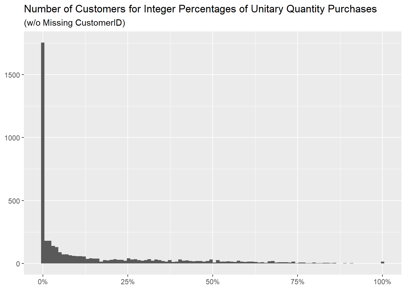
About the customers, this table misses row 209 (the one
with NA as CustomerID) from the previous one,
it is otherwise identical,
df_outlier_noNAsCustomerID %>%
  mutate("Unitary Quantity" = if_else(Quantity == 1, TRUE, FALSE)) %>%
  group_by(CustomerID) %>%
  summarise("Rounded Median Quantity" = round(median(Quantity), 0),
            "Number of Purchases" = n(),
            "Percentage of Unitary Quantity Purchases" = formattable::percent(mean(`Unitary Quantity`))) %>%
  arrange(desc(`Percentage of Unitary Quantity Purchases`), desc(`Number of Purchases`))
as it is the distribution of percentages.
df_outlier_noNAsCustomerID %>%
  mutate("Unitary Quantity" = if_else(Quantity == 1, TRUE, FALSE)) %>%
  group_by(CustomerID) %>%
  summarise("Percentage of Unitary Quantity Purchases" = formattable::percent(mean(`Unitary Quantity`))) %>%
  count(`Percentage of Unitary Quantity Purchases`, name = "Number of Customers", sort = TRUE)
df_outlier_noNAsCustomerID %>%
  mutate("Unitary Quantity" = if_else(Quantity == 1, TRUE, FALSE)) %>%
  group_by(CustomerID) %>%
  summarise("Percentage of Unitary Quantity Purchases" = mean(`Unitary Quantity`)) %>%
  ggplot(aes(`Percentage of Unitary Quantity Purchases`)) +
  geom_histogram(bins = 100) +
  scale_x_continuous(labels = scales::label_percent()) +
  labs(x = NULL,
       y = NULL,
       title = "Number of Customers for Integer Percentages of Unitary Quantity Purchases",
       subtitle = "(w/o Missing CustomerID)")
The table about countries has some differences, that depend on the
number of NAs in the CustomerID column for
every country,
df_outlier %>%
  filter(is.na(CustomerID)) %>%
  count(Country, sort = TRUE, name = "Number of NAs")
thus for example United Kingdom is more impacted as it
loses 101563 rows while Nigeria is not as it
loses none.
df_outlier_noNAsCustomerID %>%
  mutate("Unitary Quantity" = if_else(Quantity == 1, TRUE, FALSE)) %>%
  group_by(Country) %>%
  summarise("Number of Purchases" = n(),
            "Percentage of Unitary Quantity Purchases" = formattable::percent(mean(`Unitary Quantity`))) %>%
  arrange(desc(`Percentage of Unitary Quantity Purchases`))
- main takeaways
We didn’t find any typos or unreasonable values in the
Quantity column, with no specific instances worth of deeper
investigations or removals.
We built an understanding thought about purchases that are either
much greater or much smaller than the rest, identifying the items more
usually belonging to those, the clients responsible for them and in
which days they are more common to happen.