- main takeaways
We here briefly analyzed different times series related to sales data, picking cases extracted from analyses contained in previous documents.
In this page we will analyze different time series present in our data, always with a focus on sales or sales related figures.
In a previous document we noticed that our daily confirmed invoices are on a generally positive upward trend.
library(ggplot2)
df %>%
  mutate(Status = forcats::fct_rev(if_else(str_detect(Invoice, "C"), "Cancelled", "Confirmed")),
         InvoiceDay = as.Date(InvoiceDate)) %>%
  group_by(InvoiceDay, Status) %>%
  summarise("Number of Invoices per Day" = n_distinct(Invoice), .groups = "drop") %>%
  ggplot(aes(InvoiceDay, `Number of Invoices per Day`, linetype = Status)) +
  geom_line() +
  labs(x = NULL,
       y = NULL,
       title = "Number of Invoices per Day, differentiating by Status") +
  theme(legend.position = "bottom",
        legend.title = element_blank())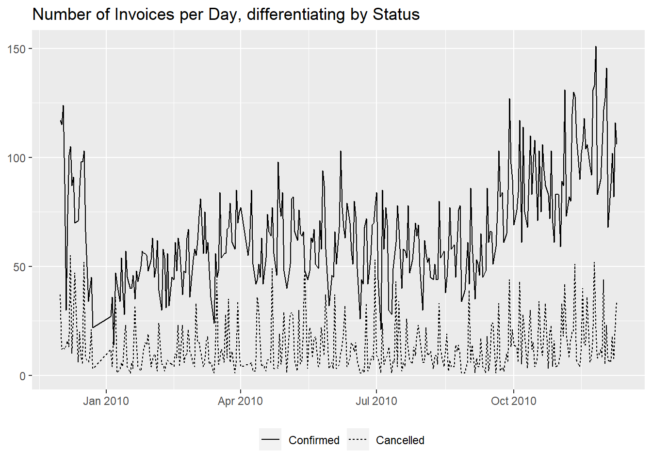
Of course that might be just a seasonal effect, with higher sales volumes determined by the end of the year holiday period.
Anyway, to investigate further, we can at first show the distribution of values, to assess the magnitude of variations.
df %>%
  filter(!str_starts(Invoice, "C")) %>%
  mutate(InvoiceDay = as.Date(InvoiceDate)) %>%
  group_by(InvoiceDay) %>%
  summarise("Number of Invoices per Day" = n_distinct(Invoice)) %>%
  reframe(Value = summary(`Number of Invoices per Day`)) %>%
  mutate(Statistic = c("Min.", "1st Qu.", "Median", "Mean", "3rd Qu.", "Max"), .before = Value)
Next we can use the STL decomposition, which it is used to separate the time series into different components: trend, seasonality and remainder.
library(tsibble)
library(feasts)
df %>%
  filter(!str_starts(Invoice, "C")) %>%
  mutate(InvoiceDay = as.Date(InvoiceDate)) %>%
  group_by(InvoiceDay) %>%
  summarise("Invoices per Day" = n_distinct(Invoice)) %>%
  mutate(days = 1:n(), .before = "InvoiceDay") %>%
  tsibble(index = days) %>%
#we can't use `InvoiceDay` as index for gaps caused by national holidays
  model(STL(`Invoices per Day`, robust = TRUE)) %>%
#robust = TRUE, for the outliers to not influence the trend
  components() %>%
  autoplot(scale_bars = FALSE) +
  theme(axis.text.x = element_blank()) +
  labs(x = NULL)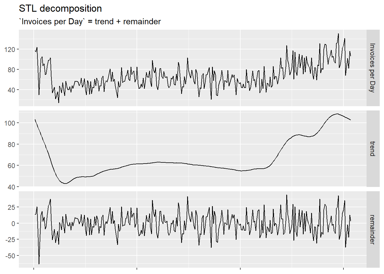
Here the decomposition returned two lines: the trend and the remainder, that added together would sum up to the initial curve.
The remainder is what the model can’t assign to any other component; we can think of it as “noise”, variations around the trend. More interesting is that it didn’t return a seasonality, meaning that the retailer has no significant recurring highs or lows in sales over fixed chronological segments smaller that a year (like weeks or months).
To correctly read the graph, it is important to notice that each component has its own scale.
We can progress this analysis by choosing different parameters for the model, to see if they change the results, and afterwards venture into forecasting how many confirmed daily invoices there will be in a following period.
Instead of the overall sales, we can direct this kind of analysis
also to a singular stock code, for example the most popular one,
85123A, as ascertained in a previous
document.
We can start with its distribution of confirmed quantities per day,
df %>%
  filter(!str_starts(Invoice, "C") &
           StockCode == "85123A") %>%
  mutate(InvoiceDay = as.Date(InvoiceDate)) %>%
  group_by(InvoiceDay) %>%
  summarize("Daily Quantity" = sum(Quantity)) %>%
  reframe(Value = summary(`Daily Quantity`)) %>%
  mutate(Statistic = c("Min.", "1st Qu.", "Median", "Mean", "3rd Qu.", "Max"), .before = Value)
then we plot the time series,
df %>%
  filter(!str_starts(Invoice, "C") &
           StockCode == "85123A") %>%
  mutate(InvoiceDay = as.Date(InvoiceDate)) %>%
  group_by(InvoiceDay) %>%
  summarize("Daily Quantity" = sum(Quantity)) %>%
  ggplot(aes(InvoiceDay, `Daily Quantity`)) +
  geom_line() +
  labs(x = NULL,
       y = NULL,
       title = "Daily Quantities for StockCode 85123A")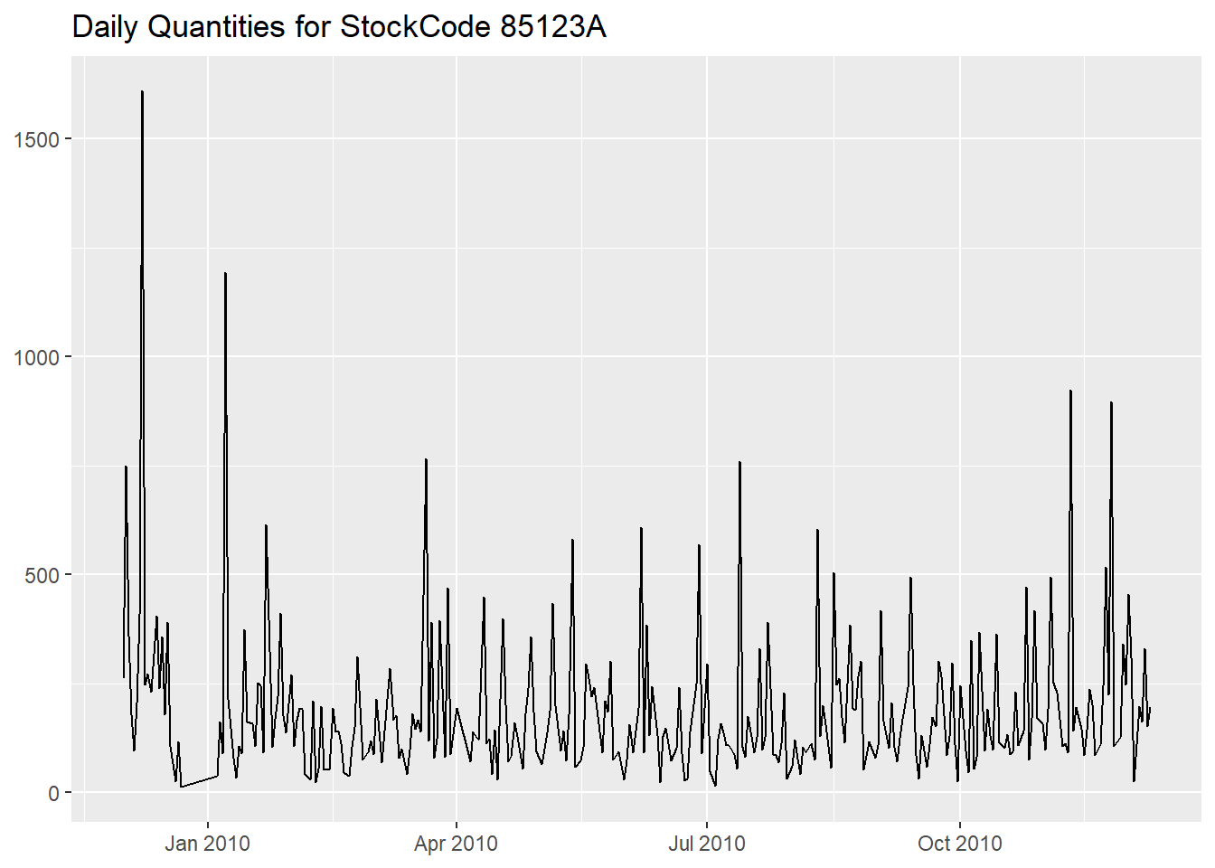
and lastly we apply the decomposition.
df %>%
  filter(!str_starts(Invoice, "C") &
           StockCode == "85123A") %>%
  mutate(InvoiceDay = as.Date(InvoiceDate)) %>%
  group_by(InvoiceDay) %>%
  summarize("Daily Quantity" = sum(Quantity)) %>%
  mutate(days = 1:n(), .before = "InvoiceDay") %>%
  tsibble(index = days) %>%
#we can't use `InvoiceDay` as index for gaps caused by national holidays
  model(STL(`Daily Quantity`, robust = TRUE)) %>%
#robust = TRUE, for the outliers to not influence the trend
  components() %>%
  autoplot(scale_bars = FALSE) +
  theme(axis.text.x = element_blank()) +
  labs(x = NULL)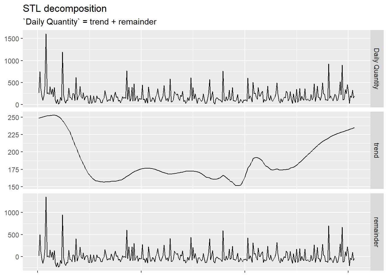
As before, the relationship between the two components is still addictive and no seasonality has been detected.
We notice that the trend is similar to the one of the overall
invoices per day but its scale is much smaller (with a range of around
100 units) and that the remainder, with all its peaks, is
more significant in determining the overall volume of sales.
We have some tools to analyse those peaks and that is anomaly detection, which returns all the data points but the ones deemed as so with a circle around them.
library(anomalize)
df %>%
  filter(!str_starts(Invoice, "C") &
           StockCode == "85123A") %>%
  mutate(InvoiceDay = as.Date(InvoiceDate)) %>%
  group_by(InvoiceDay) %>%
  summarize("Daily Quantity" = sum(Quantity)) %>%
  tibble() %>%
  tibbletime::as_tbl_time(index = InvoiceDay) %>%
  time_decompose(`Daily Quantity`, method = "stl", frequency = "auto", trend = "auto") %>%
  anomalize(remainder, method = "iqr", alpha = 0.05, max_anoms = 0.2) %>%
  plot_anomalies(alpha_dots = 0, color_yes = "#2c3e50") +
  geom_line(aes(InvoiceDay, observed)) +
  labs(x = NULL,
       y = NULL) +
  theme(legend.position = "none")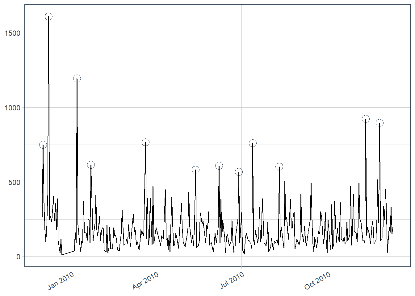
Anomalies are determined by analyzing the remainder, and its values that surpasses a certain threshold (determined by us) are marked as such.
We could then decide to substitute those anomalies with more common values and then run another decomposition, to see if the new curves provide new insights.
We can also try to graph the behavior of a customer, here we took the
most active, 14911 (always gathered from a previous
analysis).
df %>%
  filter(!str_starts(Invoice, "C") &
           CustomerID == "14911") %>%
  summarise("Number of Confirmed Invoices" = n_distinct(Invoice),
            "Number of Distinct Items Bought" = n_distinct(StockCode))
and we first look at the regularity of purchases along the year.
df %>%
  filter(!str_starts(Invoice, "C") &
           CustomerID == "14911") %>%
  mutate(InvoiceDay = as.Date(InvoiceDate)) %>%
  ggplot(aes(InvoiceDay, 5)) +
  geom_point() +
  labs(x = NULL,
       y = NULL,
       title = "Days with an Invoice for Customer 14911") +
  theme(axis.text.y = element_blank(),
        axis.ticks.y = element_blank())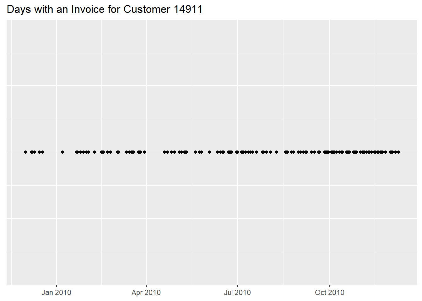
We can add another dimension to the previous graph by plotting the number of confirmed invoices per day
df %>%
  filter(!str_starts(Invoice, "C") &
           CustomerID == "14911") %>%
  mutate(InvoiceDay = as.Date(InvoiceDate)) %>%
  group_by(InvoiceDay) %>%
  summarise("Number of Invoices" = n_distinct(Invoice)) %>%
  ggplot(aes(InvoiceDay, `Number of Invoices`)) +
  geom_point() +
  labs(x = NULL,
       y = NULL,
       title = "Daily Confirmed Invoices for Customer 14911")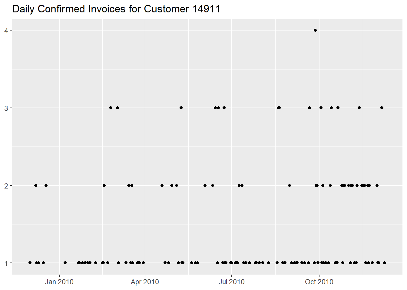
or the daily quantities purchased,
df %>%
  filter(!str_starts(Invoice, "C") &
           CustomerID == "14911") %>%
  mutate(InvoiceDay = as.Date(InvoiceDate)) %>%
  group_by(InvoiceDay) %>%
  summarise("Daily Quantity" = sum(Quantity)) %>%
  ggplot(aes(InvoiceDay, `Daily Quantity`)) +
  geom_line() +
  labs(x = NULL,
       y = NULL,
       title = "Daily Quantities for Customer 14911")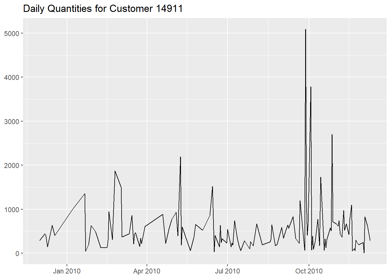
The second graph shows some drastic peaks around
October 2010, especially on the
27th of September.
df %>%
  filter(!str_starts(Invoice, "C") &
           CustomerID == "14911") %>%
  mutate(InvoiceDay = as.Date(InvoiceDate)) %>%
  group_by(InvoiceDay) %>%
  summarise("Daily Quantity" = sum(Quantity)) %>%
  arrange(desc(`Daily Quantity`))
On that particular day we see that there were also some cancelled invoices.
df %>%
  filter(CustomerID == "14911") %>%
  mutate(Status = forcats::fct_rev(if_else(str_detect(Invoice, "C"), "Cancelled", "Confirmed")),
         InvoiceDay = as.Date(InvoiceDate)) %>%
  group_by(InvoiceDay, Invoice, Status) %>%
  summarise("Daily Quantity" = sum(abs(Quantity)), .groups = "drop") %>%
  ggplot(aes(InvoiceDay, `Daily Quantity`, linetype = Status)) +
  geom_line() +
  facet_wrap(~ Status, nrow = 2) +
  labs(x = NULL,
       y = NULL,
       title = "Daily Quantities for Customer 14911, differentiating by Status") +
  theme(legend.position = "none")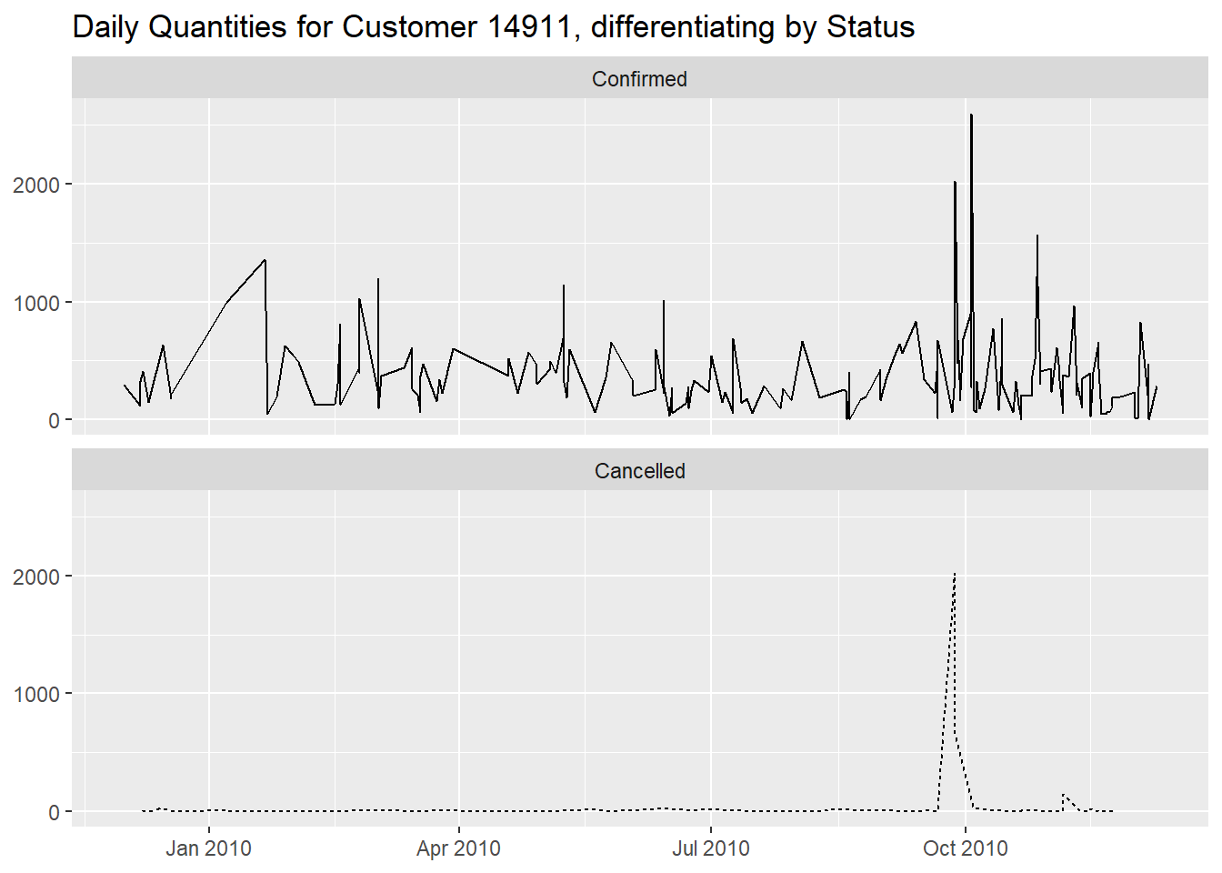
df %>%
  mutate(Status = forcats::fct_rev(if_else(str_detect(Invoice, "C"), "Cancelled", "Confirmed")),
         InvoiceDay = as.Date(InvoiceDate)) %>%
  filter(CustomerID == "14911" &
           InvoiceDay == as.Date("2010-09-27")) %>%
  group_by(InvoiceDate, Invoice, Status) %>%
  summarise("Daily Quantity" = sum(abs(Quantity)), .groups = "drop")
The number of distinct items doesn’t seem to differ too much from the rest of the time frame, meaning that is was just their quantity that changed.
df %>%
  filter(!str_starts(Invoice, "C") &
           CustomerID == "14911") %>%
  group_by(InvoiceDate, Invoice) %>%
  summarise("Number of Distinct Items" = n_distinct(StockCode), .groups = "drop_last") %>%
  ggplot(aes(InvoiceDate, `Number of Distinct Items`)) +
  geom_line() +
  labs(x = NULL,
       y = NULL,
       title = "Number of Distinct Items per Invoice for Customer 14911")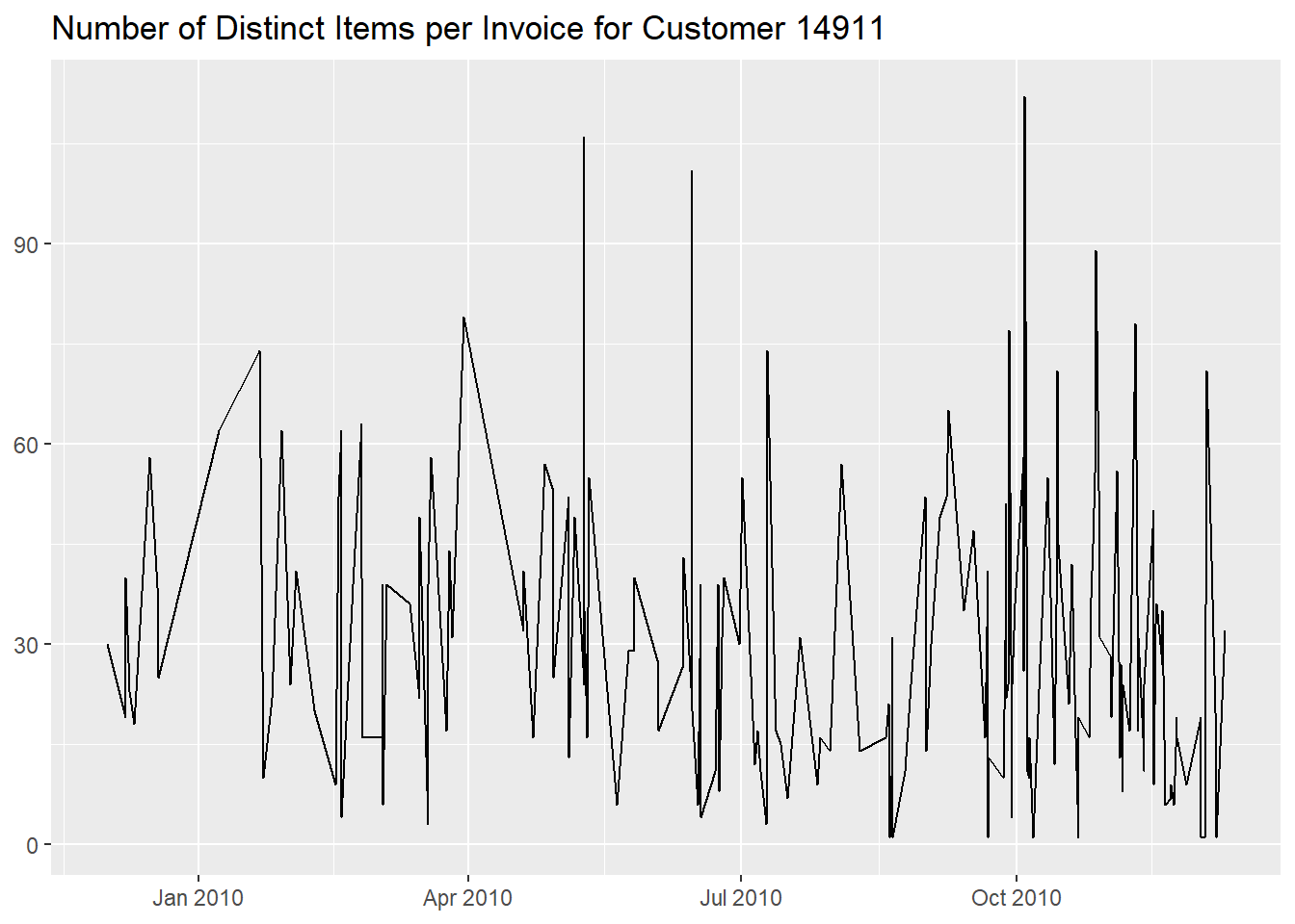
160 stock codes have been bought only during those days
though, and if we look at them we see that most are
Christmas related.
df %>%
  filter(!str_starts(Invoice, "C") &
           CustomerID == "14911") %>%
  mutate(InvoiceDay = as.Date(InvoiceDate),
         "Problematic Days" = if_else(InvoiceDay %in% seq.Date(as.Date("2010-09-27"), as.Date("2010-10-27"), by = 1), "Purchases During Those Days", "Purchases Not During Those Days")) %>%
  count(StockCode, Description, `Problematic Days`) %>%
  tidyr::pivot_wider(names_from = `Problematic Days`, values_from = n, values_fill = 0) %>%
  rowwise() %>%
  mutate("Presence Rate" =  formattable::percent(`Purchases During Those Days` / sum(`Purchases During Those Days`, `Purchases Not During Those Days`))) %>%
  relocate(`Presence Rate`, .after = Description) %>%
  arrange(desc(`Presence Rate`), desc(`Purchases During Those Days`))
The number of regularly bought stock codes never bought during those
days is much larger (more than 1000), meaning that the
purchasing behavior is different than usual.
df %>%
  filter(!str_starts(Invoice, "C") &
           CustomerID == "14911") %>%
  mutate(InvoiceDay = as.Date(InvoiceDate),
         "Problematic Days" = if_else(InvoiceDay %in% seq.Date(as.Date("2010-09-27"), as.Date("2010-10-27"), by = 1), "Purchases During Those Days", "Purchases Not During Those Days")) %>%
  count(StockCode, `Problematic Days`) %>%
  tidyr::pivot_wider(names_from = `Problematic Days`, values_from = n, values_fill = 0) %>%
  rowwise() %>%
  mutate("Presence Rate" =  formattable::percent(`Purchases During Those Days` / sum(`Purchases During Those Days`, `Purchases Not During Those Days`))) %>%
  ungroup() %>%
  ggplot(aes(`Presence Rate`)) +
  geom_histogram(bins = 100) +
  scale_x_continuous(labels = scales::label_percent()) +
  labs(x = NULL,
       y = NULL,
       title = "Distribution of Integer Presence Rates for Distinct Stock Codes Bought \n by Customer 14911 between 2010-09-27 and 2010-10-27")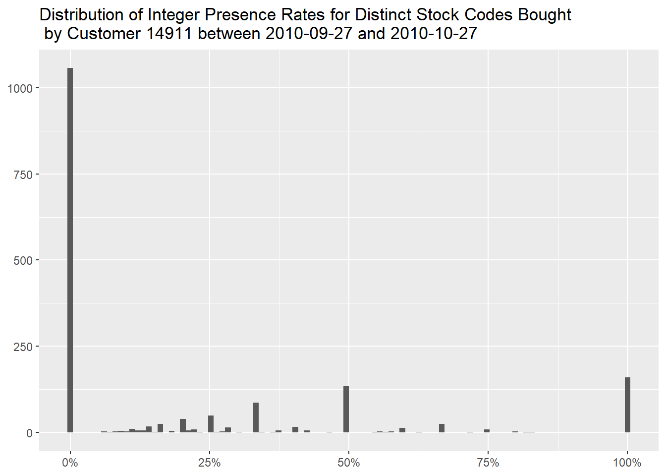
Lastly, we can examine the association of customers and stock codes,
and we choose the most frequent combination, customer 17850
with stock code 82494L,
df %>%
  filter(!is.na(CustomerID) &
           !str_starts(Invoice, "C")) %>%
  count(CustomerID, StockCode, name = "Number of Occurrences", sort = TRUE)
for a total of 112 confirmed, non duplicated,
purchases.
df %>%
  filter(CustomerID == "17850" &
           StockCode == "82494L") %>%
  distinct()
These purchases are not very frequent, as this customer has usually several invoices per day,
df %>%
    filter(CustomerID == "17850" &
           StockCode == "82494L") %>%
  mutate(InvoiceDay = as.Date(InvoiceDate)) %>%
  count(InvoiceDay, name = "Number of Invoices")
so the pattern of purchases is rather intermittent, buying
3 times per month at the beginning of the time span but
slowing down along the following months.
df %>%
  filter(CustomerID == "17850" &
           StockCode == "82494L") %>%
  ggplot(aes(InvoiceDate, 5)) +
  geom_point() +
  labs(x = NULL,
       y = NULL,
       title = "Frequency of Purchases of Stock Code 82494L for Customer 17850") +
  theme(axis.text.y = element_blank(),
        axis.ticks.y = element_blank())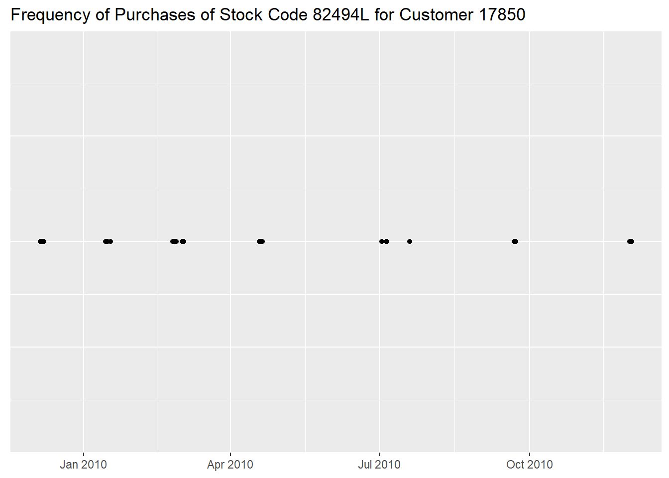
16 invoices on the 2010-07-05 are surely
curious, but, investigating further, we just see a quick succession of
similar purchases, concentrated in the morning.
df %>%
  filter(CustomerID == "17850" &
           StockCode == "82494L") %>%
  filter(as.Date(InvoiceDate) == as.Date("2010-07-05"))
If we go back to the first table of this section, we see that this
customer occupies the top10 of most frequent combinations
between customers and stock codes, so it seems that many small purchases
that could have been aggregated is its usual behavior (showing stock
code 82486 here).
df %>%
  filter(CustomerID == "17850" &
           StockCode == "82486")
Returning to stock code 82494L, we notice that, as the
frequency of invoices decreased, the maximum daily Quantity
somehow increased, probably to compensate.
df %>%
  mutate(InvoiceDay = as.Date(InvoiceDate)) %>%
  filter(CustomerID == "17850" &
           StockCode == "82494L") %>%
  group_by(InvoiceDay) %>%
  summarise("Quantity per Day" = sum(Quantity)) %>%
  ggplot(aes(InvoiceDay, `Quantity per Day`)) +
  geom_point() +
  geom_line() +
  labs(x = NULL,
       y = NULL,
       title = "Daily Quantities of Stock Code 82494L Purchased by Customer 17850")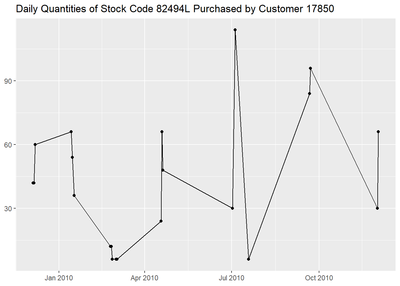
We here briefly analyzed different times series related to sales data, picking cases extracted from analyses contained in previous documents.