After having examined the data from an invoice point of view, we
continue here in the same vein but focusing on the items, keeping in
mind that we don’t have access to the complete inventory but only to the
items that have been invoiced during the time frame present in our data
(a little bit more than a year).
As in the previous analysis, we decided not to remove duplicated
rows, as we prefer not to lose information about quantity even if
that might inflate the number of purchases.
- most popular items
So let’s start by counting their presence (for both confirmed and
cancelled invoices) to assess the ones appearing most frequently.
df %>%
count(StockCode, Description, sort = TRUE, name = "Number of Occurrences")
If we divide them by status we get these numbers instead,
df %>%
mutate(Status = if_else(str_detect(Invoice, "C"), "Cancelled", "Confirmed")) %>%
group_by(StockCode, Description, Status) %>%
summarise("Number of Occurrences" = n(), .groups = "drop") %>%
tidyr::pivot_wider(names_from = "Status", values_from = "Number of Occurrences", values_fill = 0) %>%
relocate("Confirmed", .after = Description) %>%
arrange(desc(Confirmed))
and we can show as well the total quantities of the confirmed and of
the cancelled orders, plus the percentage of the cancelled over the sum
of the two.
df %>%
mutate(Status = if_else(str_detect(Invoice, "C"), "Cancelled", "Confirmed")) %>%
group_by(StockCode, Description) %>%
summarise("Total Quantity Purchased" = sum(Quantity[Status == "Confirmed"]),
"Total Quantity Cancelled" = sum(abs(Quantity[Status == "Cancelled"])),
"Percentage Over Total" = formattable::percent(`Total Quantity Cancelled` / sum(`Total Quantity Purchased`, `Total Quantity Cancelled`)), .groups = "drop") %>%
arrange(desc(`Total Quantity Purchased`))
We might then be interested in knowing, for every item, the weekly,
confirmed, sales volumes and to compare them to the item’s minimum,
median and maximum overall values.
df %>%
filter(!str_starts(Invoice, "C")) %>%
mutate("Year / Week" = format(InvoiceDate, "%y/%V")) %>%
group_by(StockCode, Description, `Year / Week`) %>%
summarise("Quantity Sold" = sum(Quantity), .groups = "drop_last") %>%
mutate("Minimum Quantity Sold" = min(`Quantity Sold`),
"Median Quantity Sold" = median(`Quantity Sold`),
"Maximum Quantity Sold" = max(`Quantity Sold`)) %>%
ungroup()
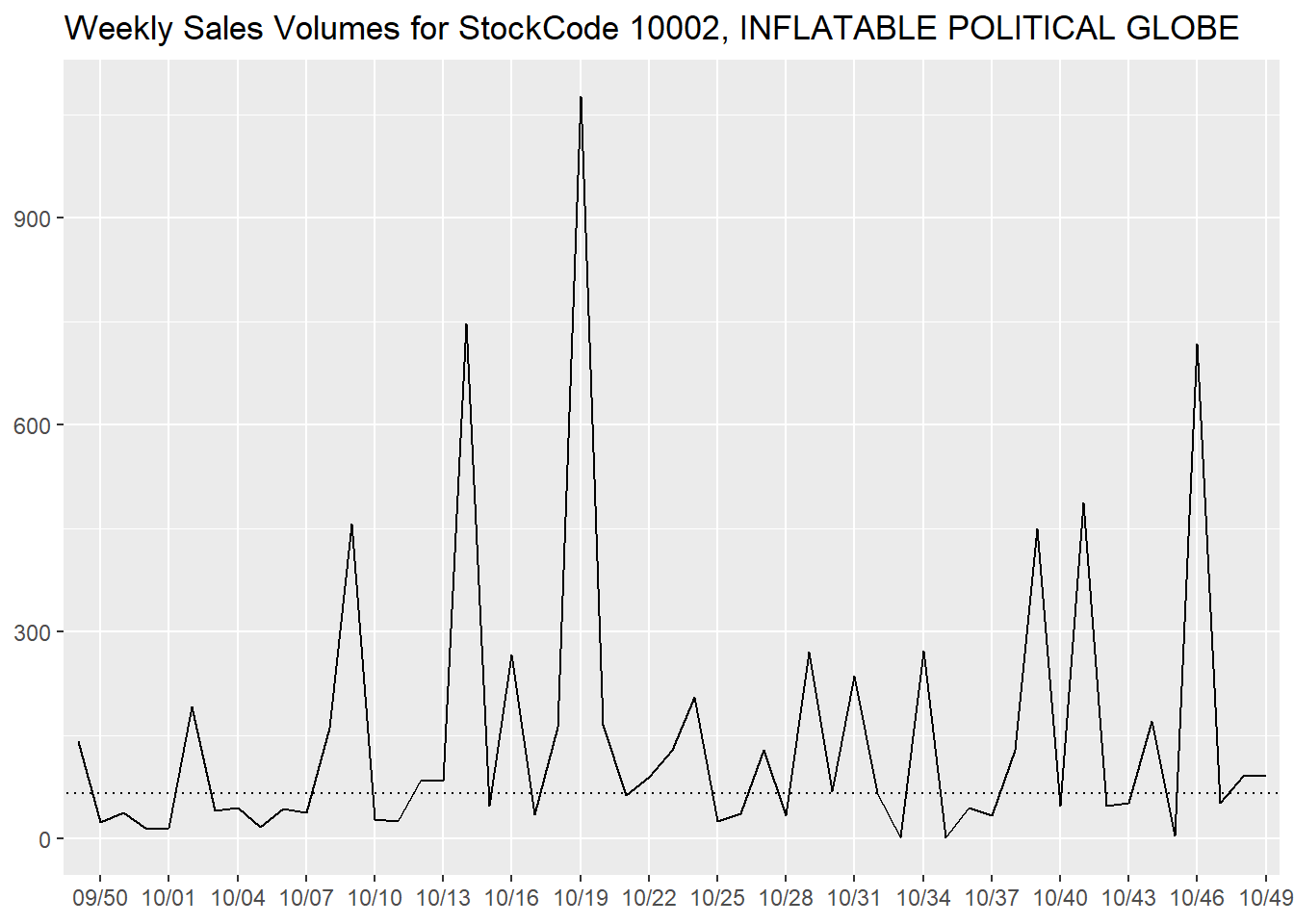
We can observe the trend of an item (INFLATABLE POLITICAL GLOBE in
this case) on a temporal scale, with a dotted line that represents the
median as a comparison.
library(ggplot2)
df %>%
filter(!str_starts(Invoice, "C")) %>%
mutate("Year / Week" = format(InvoiceDate, "%y/%V")) %>%
group_by(StockCode, Description, `Year / Week`) %>%
summarise("Quantity Sold" = sum(Quantity), .groups = "drop_last") %>%
mutate("Minimum Quantity Sold" = min(`Quantity Sold`),
"Median Quantity Sold" = median(`Quantity Sold`),
"Maximum Quantity Sold" = max(`Quantity Sold`)) %>%
ungroup() %>%
filter(StockCode == "10002") %>%
ggplot(aes(`Year / Week`, `Quantity Sold`, group = StockCode)) +
geom_line() +
geom_abline(aes(intercept = `Median Quantity Sold`, slope = 0), linetype = 3) +
scale_x_discrete(breaks = ~ .[c(FALSE, TRUE, FALSE)]) +
labs(x = NULL,
y = NULL,
title = "Weekly Sales Volumes for StockCode 10002, INFLATABLE POLITICAL GLOBE")
- most expensive items
Besides the most popular items, another thing we are interest into
are the most expensive ones, that we will rank using their median
price.
df %>%
group_by(StockCode, Description) %>%
summarise("Median Price" = median(Price),
"Number of Invoices" = n(),
"Median Quantity per Invoice" = median(Quantity), .groups = "drop") %>%
arrange(desc(`Median Price`))
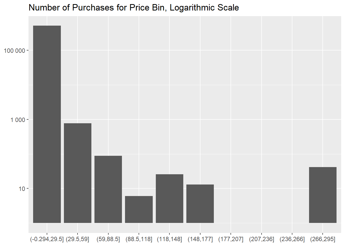
If we segment our inventory in 10 different bins of
equal size (of approximately 30 £) we notice that the bin
with the cheapest items is the most populated, by a large margin.
df %>%
group_by(StockCode, Description) %>%
mutate("Median Price" = median(Price)) %>%
group_by("Price Bins" = cut(`Median Price`, 10), .drop = FALSE) %>%
summarise("Number of Distinct Items" = n_distinct(StockCode),
"Number of Purchases" = n())
df %>%
group_by(StockCode, Description) %>%
mutate("Median Price" = median(Price)) %>%
group_by("Price Bins" = cut(`Median Price`, 10), .drop = FALSE) %>%
summarise("Number of Purchases" = n() + 1) %>%
#we add 1 to next use a logarithmic scale on the y axis
ggplot(aes(`Price Bins`, `Number of Purchases`)) +
geom_col() +
scale_y_log10(labels = scales::label_number()) +
labs(x = NULL,
y = NULL,
title = "Number of Purchases for Price Bin, Logarithmic Scale")
Ultimately, if we are interested in knowing when an item changed
price, we can use this table,
df %>%
select(InvoiceDate, StockCode, Description, Price) %>%
group_by(StockCode, Description) %>%
mutate("Price Change?" = if_else(Price != lag(Price), TRUE, FALSE)) %>%
ungroup() %>%
arrange(StockCode)
- most profitable items
Let’s isolate now our best products in term of revenues, filtering
out the cancelled invoices.
df %>%
filter(!str_starts(Invoice, "C")) %>%
mutate(Revenue = Quantity * Price) %>%
group_by(StockCode, Description) %>%
summarise("Total Revenues" = sum(Revenue),
"Number of Purchases" = n(),
"Median Price of Purchase" = median(Price),
"Median Quantity of Purchase" = median(Quantity), .groups = "drop") %>%
ungroup() %>%
arrange(desc(`Total Revenues`))
The bin with the cheapest items makes up for more than
90% of revenues as well,
df %>%
filter(!str_starts(Invoice, "C")) %>%
mutate(Revenue = Quantity * Price) %>%
group_by(StockCode, Description) %>%
mutate("Median Price" = median(Price)) %>%
group_by("Price Bins" = cut(`Median Price`, 10), .drop = FALSE) %>%
summarise("Total Revenues" = sum(Revenue)) %>%
mutate("Percentage over Total Revenues" = formattable::percent(`Total Revenues` / sum(`Total Revenues`)))
That is true also for the lost revenues of the cancelled
invoices.
df %>%
filter(str_starts(Invoice, "C")) %>%
mutate("Lost Revenues" = abs(Quantity) * Price) %>%
group_by(StockCode, Description) %>%
summarise("Total Lost Revenues" = sum(`Lost Revenues`),
"Number of Cancellations" = n(),
"Median Price" = median(Price),
"Median Quantity" = median(abs(Quantity)), .groups = "drop") %>%
ungroup() %>%
arrange(desc(`Total Lost Revenues`))
df %>%
filter(str_starts(Invoice, "C")) %>%
mutate("Lost Revenues" = abs(Quantity) * Price) %>%
group_by(StockCode, Description) %>%
mutate("Median Price" = median(Price)) %>%
group_by("Price Bins" = cut(`Median Price`, 10), .drop = FALSE) %>%
summarise("Total Lost Revenues" = sum(`Lost Revenues`)) %>%
mutate("Percentage over Total Lost Revenues" = formattable::percent(`Total Lost Revenues` / sum(`Total Lost Revenues`)))
There are two bins for which the lost revenues are, in percentage,
much higher than the others.
df %>%
mutate(Status = if_else(!str_detect(Invoice, "C"), "Revenues", "Revenues Lost for Cancellations"),
Revenue = Quantity * Price,) %>%
group_by(StockCode, Description, Status) %>%
mutate("Median Price" = median(Price)) %>%
group_by("Price Bins" = cut(`Median Price`, 10), Status, .drop = FALSE) %>%
summarise("Total Revenues" = sum(abs(Revenue)), .groups = "drop") %>%
mutate(Status = coalesce(Status, "Revenues")) %>%
#to eliminate NAs in the `Status` column for the 3 bins with no items
tidyr::pivot_wider(names_from = Status, values_from = `Total Revenues`, values_fill = 0) %>%
rowwise() %>%
mutate("Percentage over Total" = formattable::percent(`Revenues Lost for Cancellations` / sum(`Revenues`, `Revenues Lost for Cancellations`)))
- items more frequently cancelled
The cancellation of invoices is an important phenomenon, so let’s
show the cancellation rates for all the items, with the ones always
cancelled on top.
df %>%
mutate(Status = if_else(str_starts(Invoice, "C"), "Cancelled Purchases", "Confirmed Purchases")) %>%
group_by(StockCode, Description, Status) %>%
summarise("Number of Occurrences" = n(), .groups = "drop_last") %>%
tidyr::pivot_wider(names_from = Status, values_from = `Number of Occurrences`, values_fill = 0) %>%
mutate("Cancellation Rate" = formattable::percent(`Cancelled Purchases` / sum(`Confirmed Purchases`, `Cancelled Purchases`))) %>%
ungroup() %>%
relocate(`Cancellation Rate`, `Confirmed Purchases`, `Cancelled Purchases`, .after = Description) %>%
arrange(desc(`Cancellation Rate`), desc(`Cancelled Purchases`))
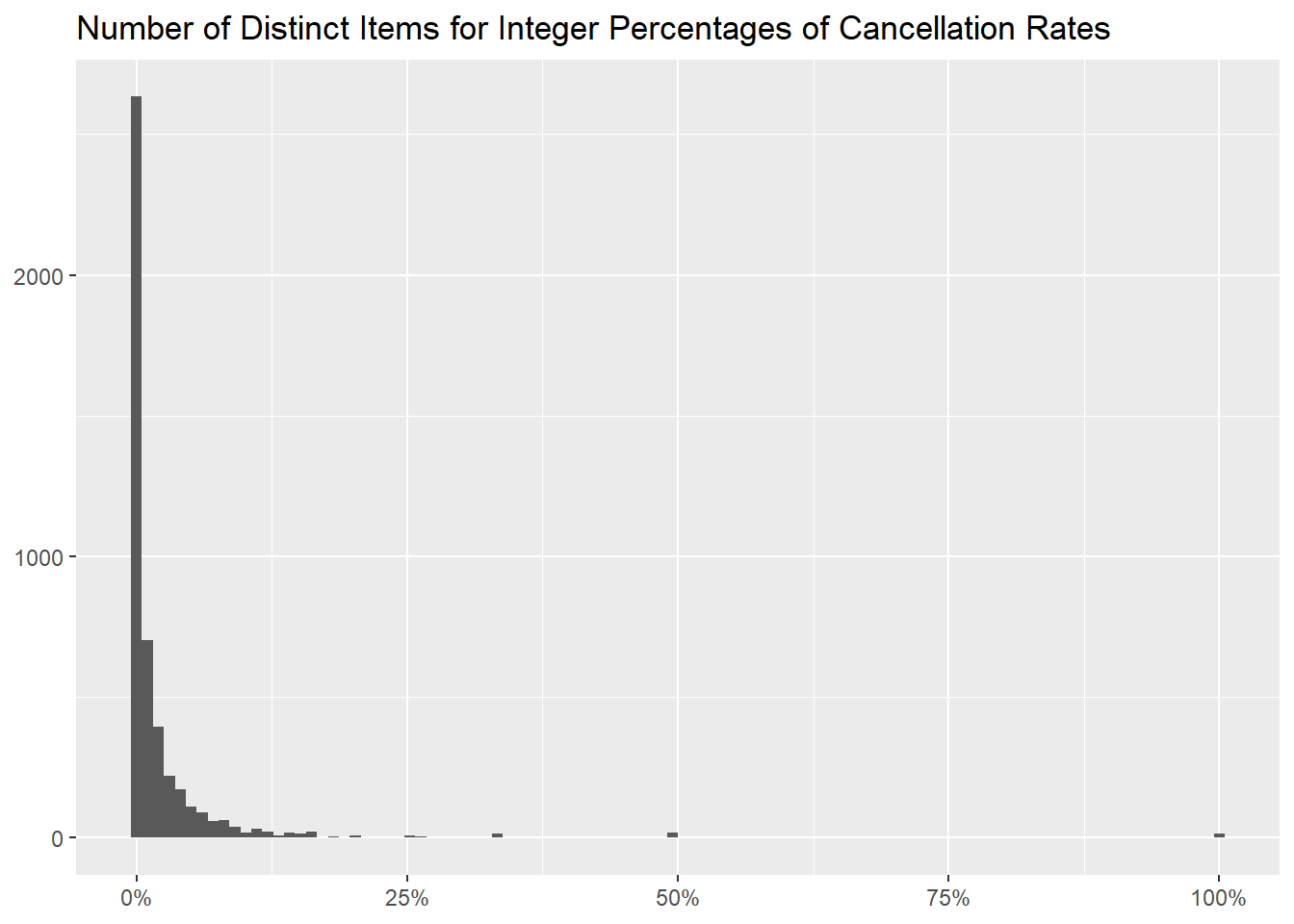
The following table and graph show the distribution of
Cancellation Rate, to more easily assess how many items are
always or never cancelled.
df %>%
mutate(Status = if_else(str_starts(Invoice, "C"), "Cancelled Purchases", "Confirmed Purchases")) %>%
group_by(StockCode, Description, Status) %>%
summarise("Number of Occurrences" = n(), .groups = "drop_last") %>%
tidyr::pivot_wider(names_from = Status, values_from = `Number of Occurrences`, values_fill = 0) %>%
mutate("Cancellation Rate" = formattable::percent(`Cancelled Purchases` / sum(`Confirmed Purchases`, `Cancelled Purchases`))) %>%
ungroup() %>%
count(`Cancellation Rate`, name = "Number of Distinct Items") %>%
mutate("Percentage of Distinct Items" = formattable::percent(`Number of Distinct Items` / sum(`Number of Distinct Items`))) %>%
arrange(desc(`Number of Distinct Items`), desc(`Cancellation Rate`))
df %>%
mutate(Status = if_else(str_starts(Invoice, "C"), "Cancelled Purchases", "Confirmed Purchases")) %>%
group_by(StockCode, Description, Status) %>%
summarise("Number of Occurrences" = n(), .groups = "drop_last") %>%
tidyr::pivot_wider(names_from = Status, values_from = `Number of Occurrences`, values_fill = 0) %>%
mutate("Cancellation Rate" = formattable::percent(`Cancelled Purchases` / sum(`Confirmed Purchases`, `Cancelled Purchases`))) %>%
ungroup() %>%
ggplot(aes(`Cancellation Rate`)) +
geom_histogram(bins = 100) +
scale_x_continuous(labels = scales::label_percent()) +
labs(x = NULL,
y = NULL,
title = "Number of Distinct Items for Integer Percentages of Cancellation Rates")
- quantities per month
We can then produce a table with the monthly quantities sold for
every item, useful to investigate seasonal trends.
df %>%
filter(!str_starts(Invoice, "C")) %>%
mutate(Month = format(InvoiceDate, "%y/%m")) %>%
group_by(StockCode, Description, Month) %>%
summarise(Quantity = sum(Quantity), .groups = "drop") %>%
tidyr::pivot_wider(names_from = Month, values_from = Quantity, names_sort = TRUE) %>%
mutate("Total Quantity" = rowSums(across(where(is.numeric)), na.rm = TRUE),
"Monthly Average" = round(rowMeans(across(where(is.numeric)), na.rm = TRUE), 2),
"Number of Missing Months" = rowSums(is.na(pick(everything()))), .after = "Description") %>%
arrange(desc(`Total Quantity`))
- country breakdown
Let’s take a look now at what items are popular in more countries,
showing first the number of invoices (confirmed and cancelled both) they
appear in
df %>%
count(Country, StockCode, Description, name = "Number of Occurrences") %>%
tidyr::pivot_wider(names_from = Country, values_from = `Number of Occurrences`) %>%
mutate("Number of Countries Invoiced In" = nrow(count(df, Country)) - rowSums(is.na(pick(everything()))), .after = Description) %>%
arrange(desc(`Number of Countries Invoiced In`))
and then the quantities effectively sold.
df %>%
filter(!str_starts(Invoice, "C")) %>%
group_by(Country, StockCode, Description) %>%
summarise("Total Quantity" = sum(Quantity), .groups = "drop") %>%
tidyr::pivot_wider(names_from = Country, values_from = `Total Quantity`) %>%
mutate("Number of Countries Sold In" = nrow(count(df, Country)) - rowSums(is.na(pick(everything()))), .after = Description) %>%
arrange(desc(`Number of Countries Sold In`))
We can also be interested in knowing if an item has different prices
across the different countries it is sold in, using the median one as
the metric.
df %>%
filter(!str_starts(Invoice, "C")) %>%
group_by(Country, StockCode, Description) %>%
summarise("Rounded Median Price" = round(median(Price), 2), .groups = "drop") %>%
tidyr::pivot_wider(names_from = Country, values_from = `Rounded Median Price`) %>%
left_join(df %>%
filter(!str_starts(Invoice, "C")) %>%
group_by(StockCode, Description) %>%
summarise("Global Rounded Median Price" = round(median(Price), 2), .groups = "drop"), by = c("StockCode", "Description")) %>%
relocate(`Global Rounded Median Price`, .after = Description)
- main takeaways
We produced various tables that can be explored further to gain
insights on what items perform best for certain common metrics like the
most commonly sold and the ones yielding highest revenues. The
problematic phenomenon of cancellations has also been examined, together
with a breakdown by countries.